
Houdini’s Library Exhibition
Scope: Branding, Environmental, and Print Design
Overview
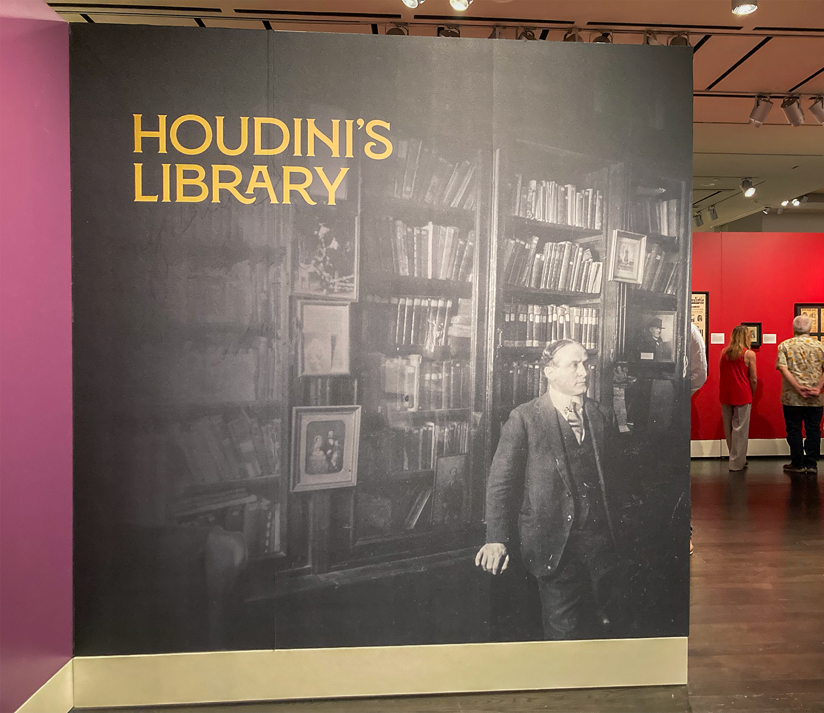
During my time at the Harry Ransom Center, I was tasked with designing an identity for the exhibition Houdini’s Library, an exhibition that aimed to showcase Harry Houdini’s massive collection.
I worked closely with the exhibition curator, Dr. Eric Colleary, and the Harry Ransom Center’s Director of Exhibitions, Erica Nunn-Kinias. Dr. Colleary wanted patrons to walk away with a new understanding of Houdini – the quiet, committed man that relentlessly collected materials to better understand and study his craft.
My Approach
I knew the branding for this exhibition had to meet audience expectations for the legendary personality of Harry Houdini the showman and performer. However, I aimed to balance that grandiosity with a literary feel, taking inspiration from book covers and title pages.
Research and Mood Boards
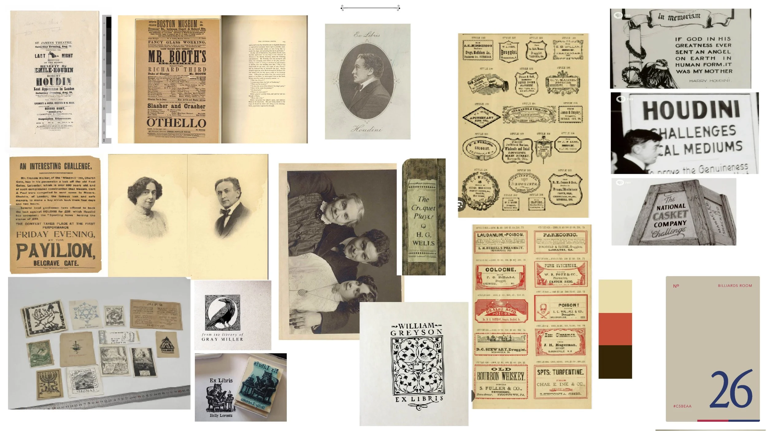
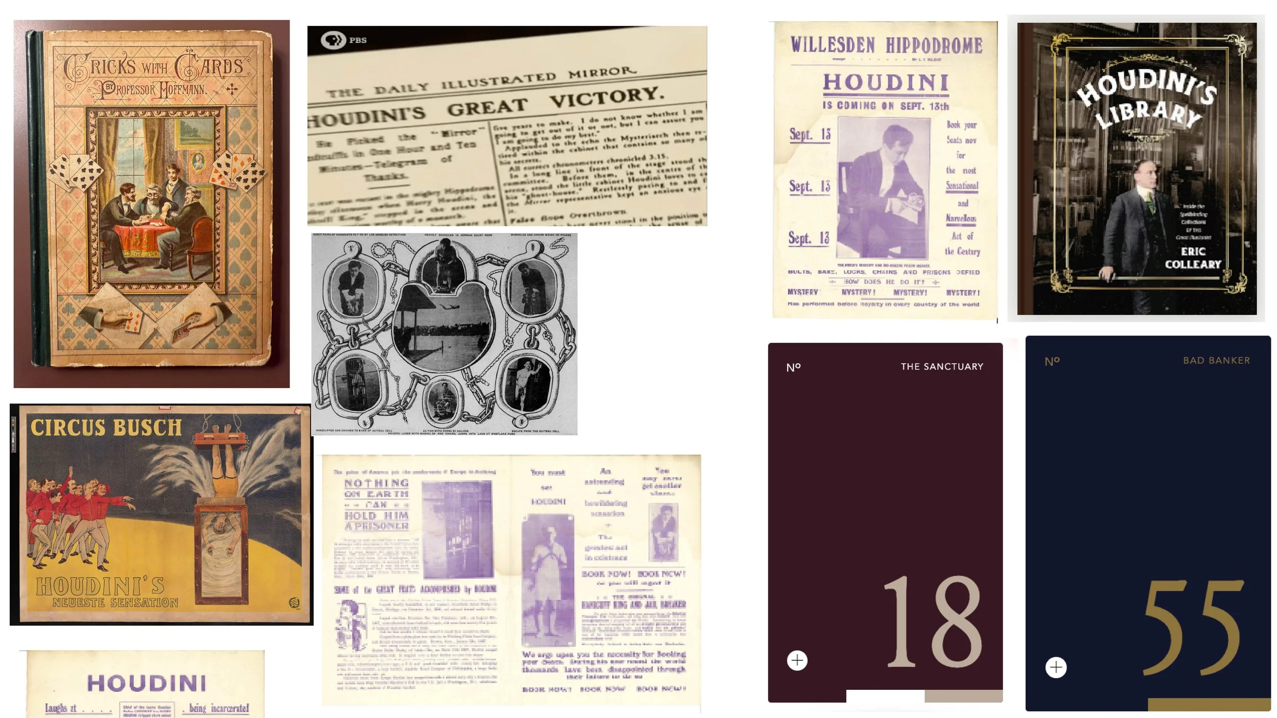
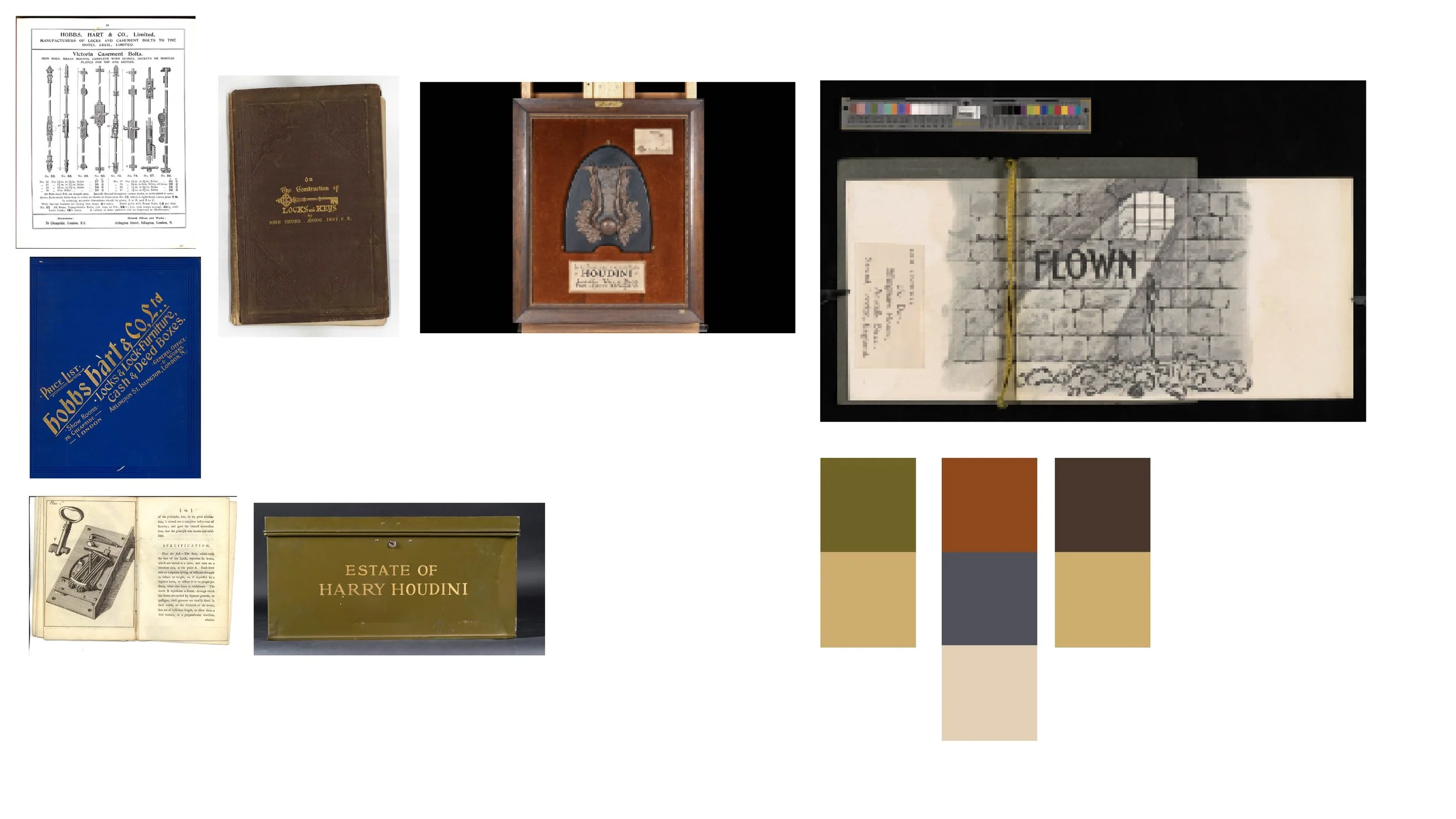
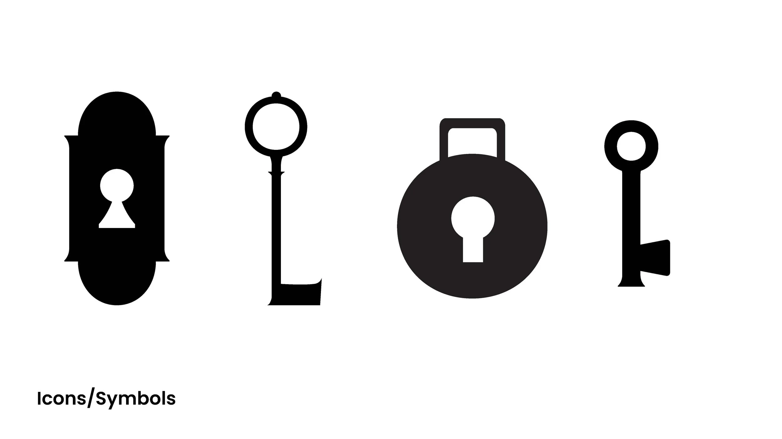
I looked into Houdini’s collection for inspiration including posters, books, and personal items. I brainstormed different themes to explore in my design. The three main themes were 1. Learning: Books, papers, leather, academic 2. Framing devices: keyhole, door, curtain, dark, moody mysterious, and 3. Discovery: trunk, key, lock, green, gold.
First Round Brand Design
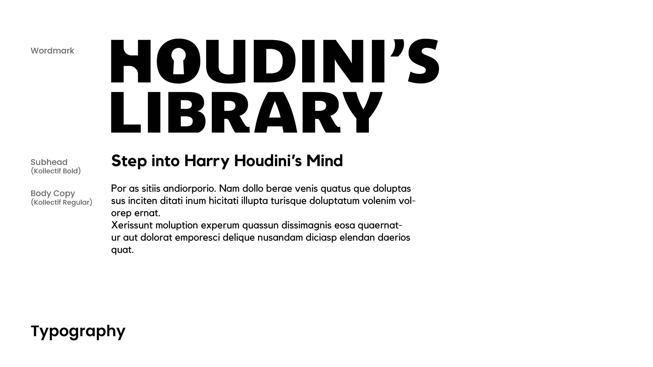
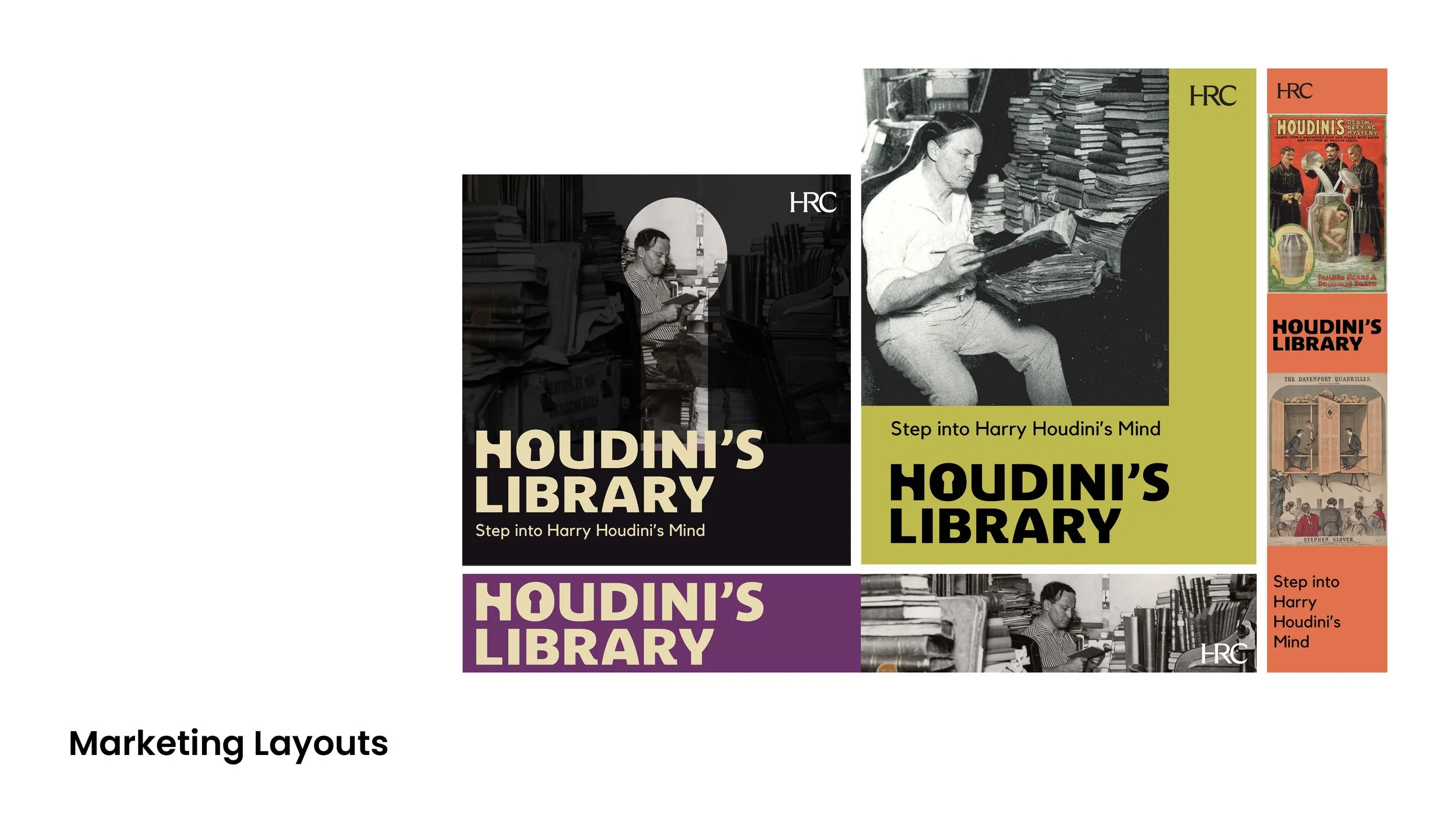
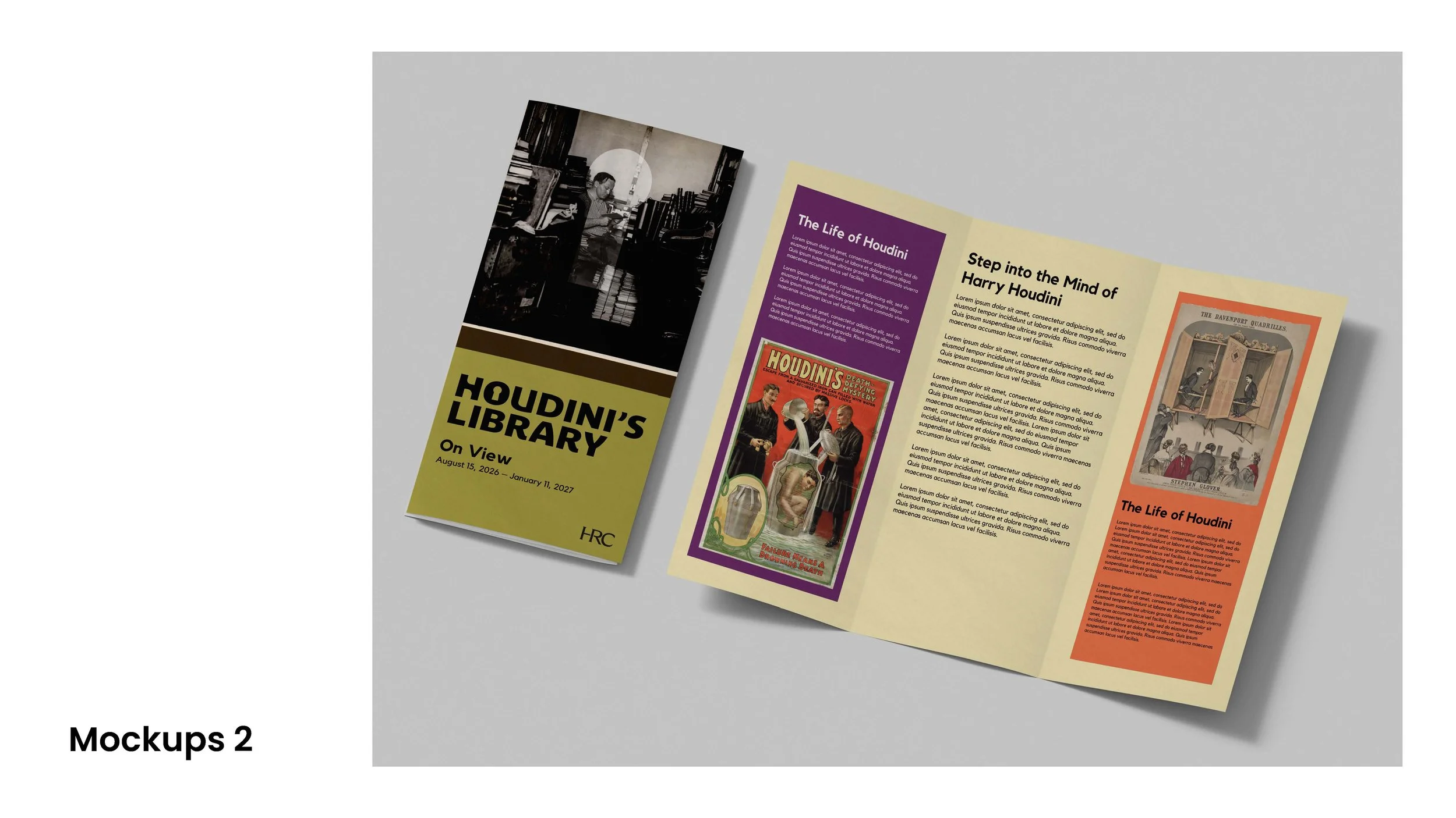
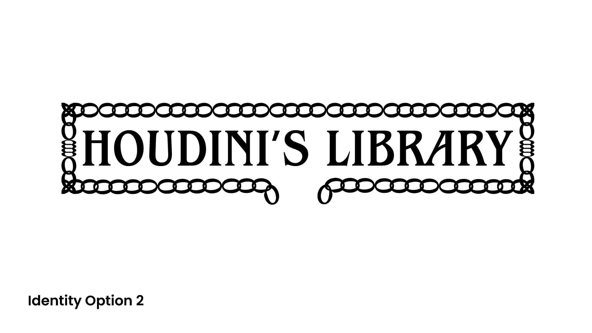
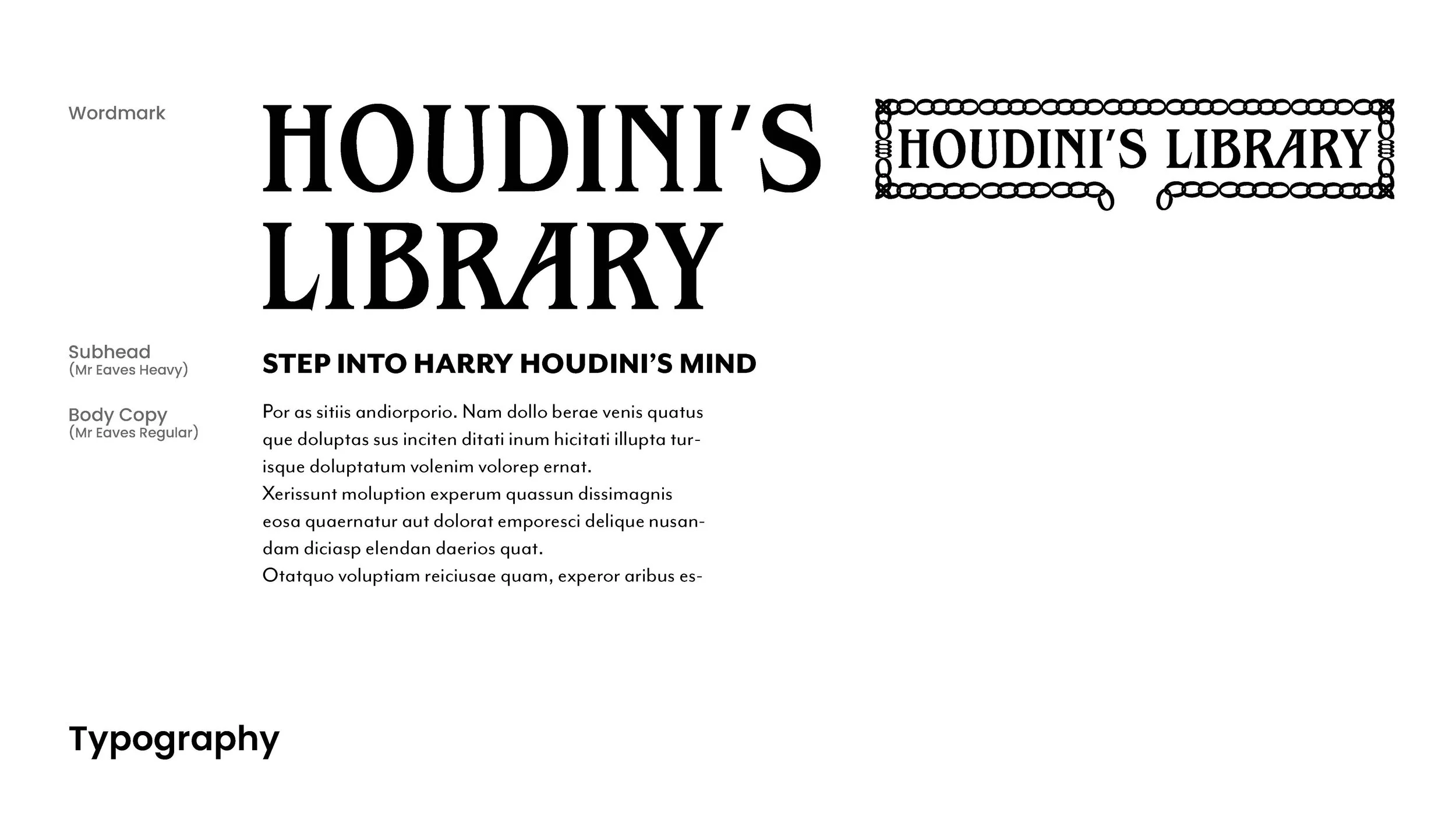
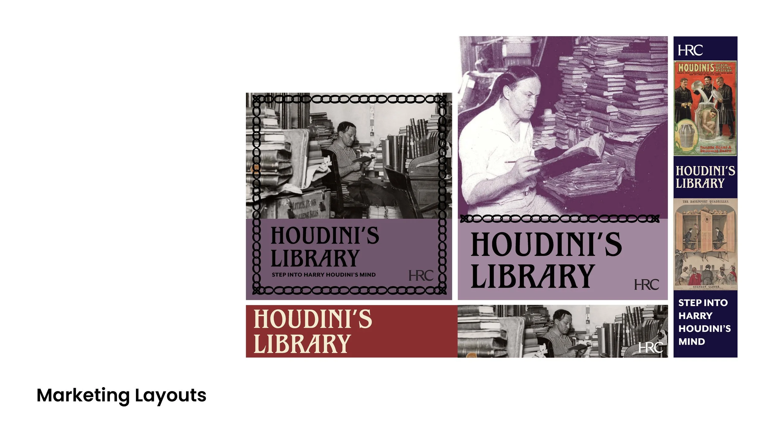
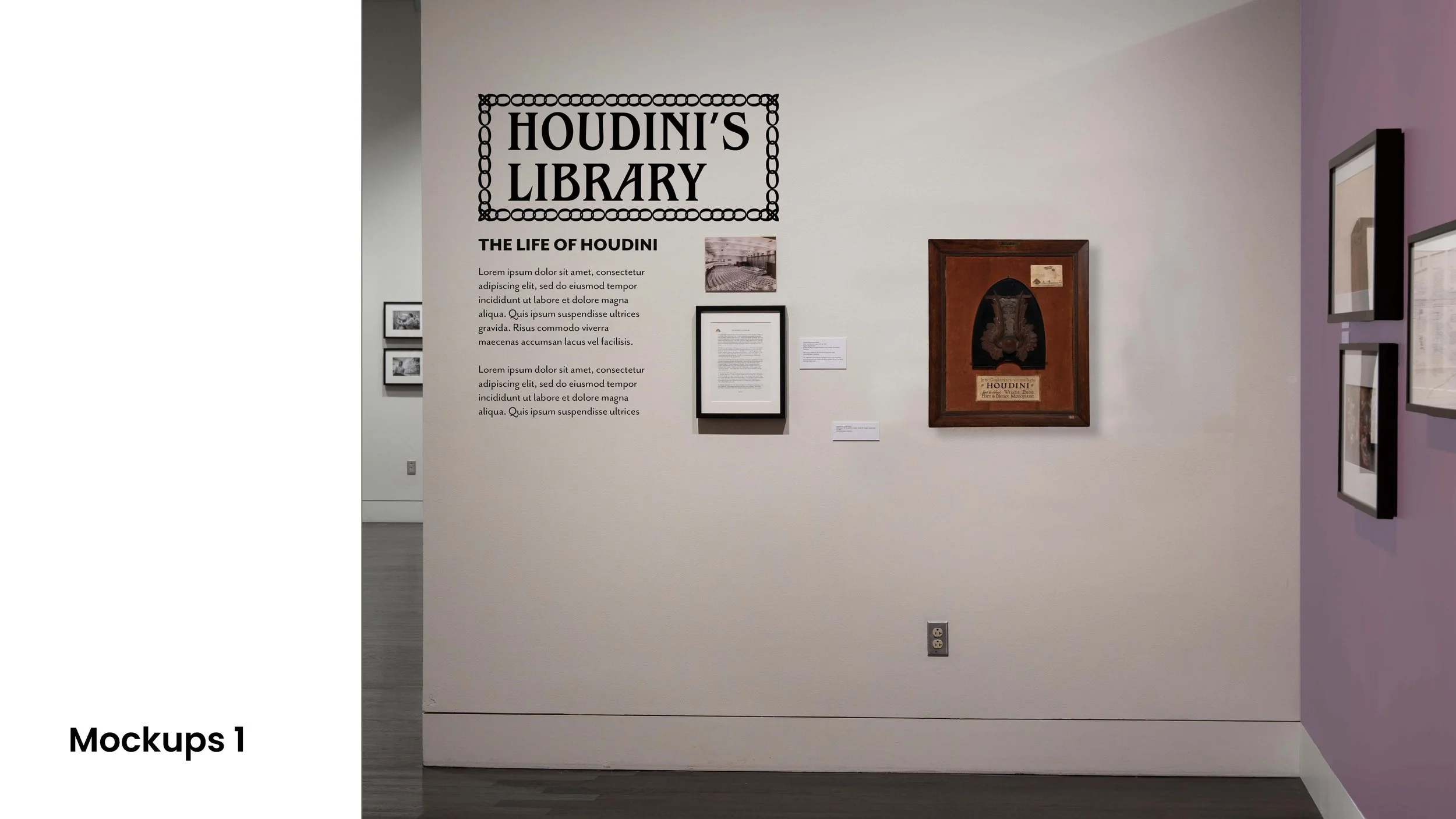
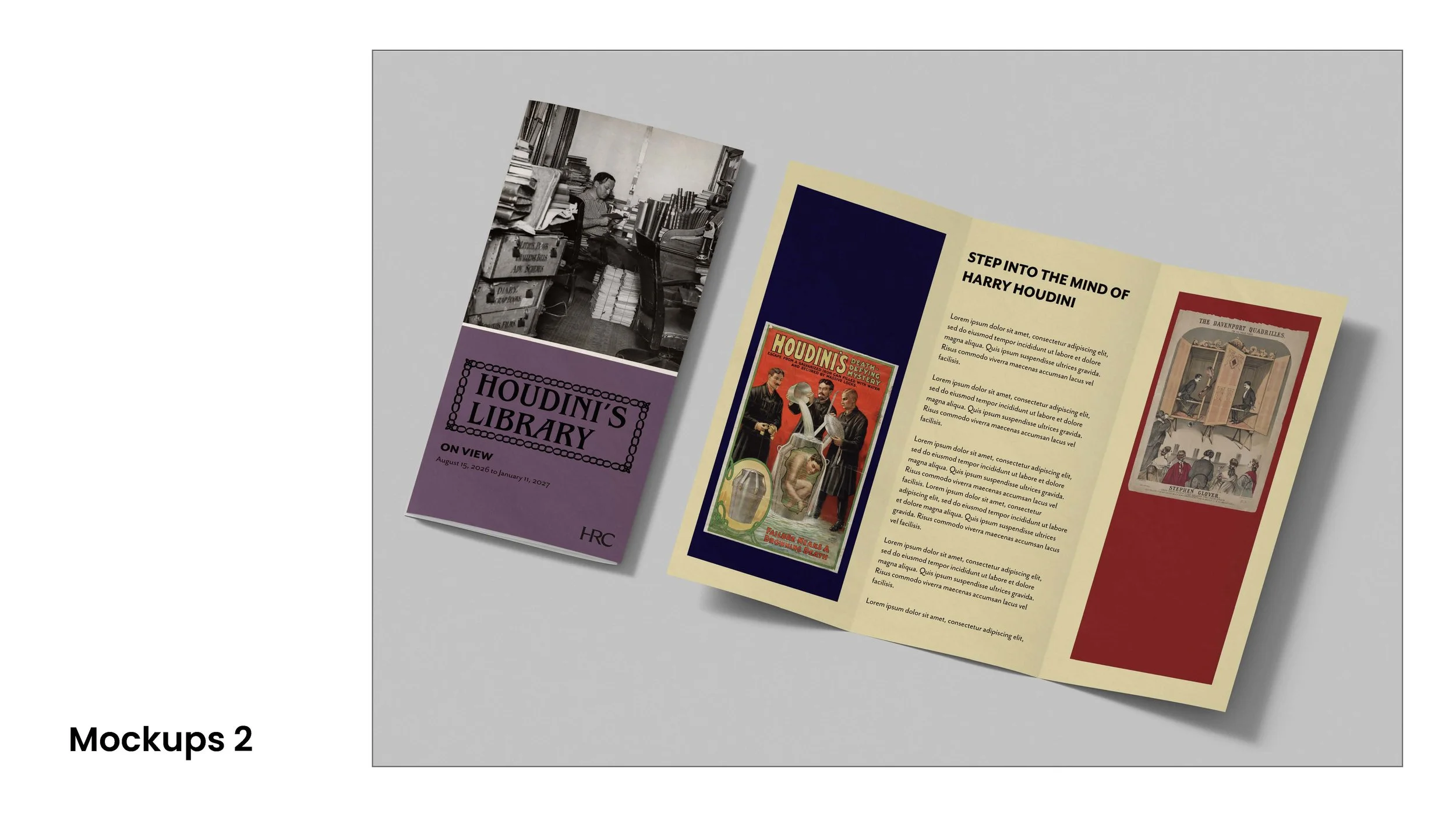
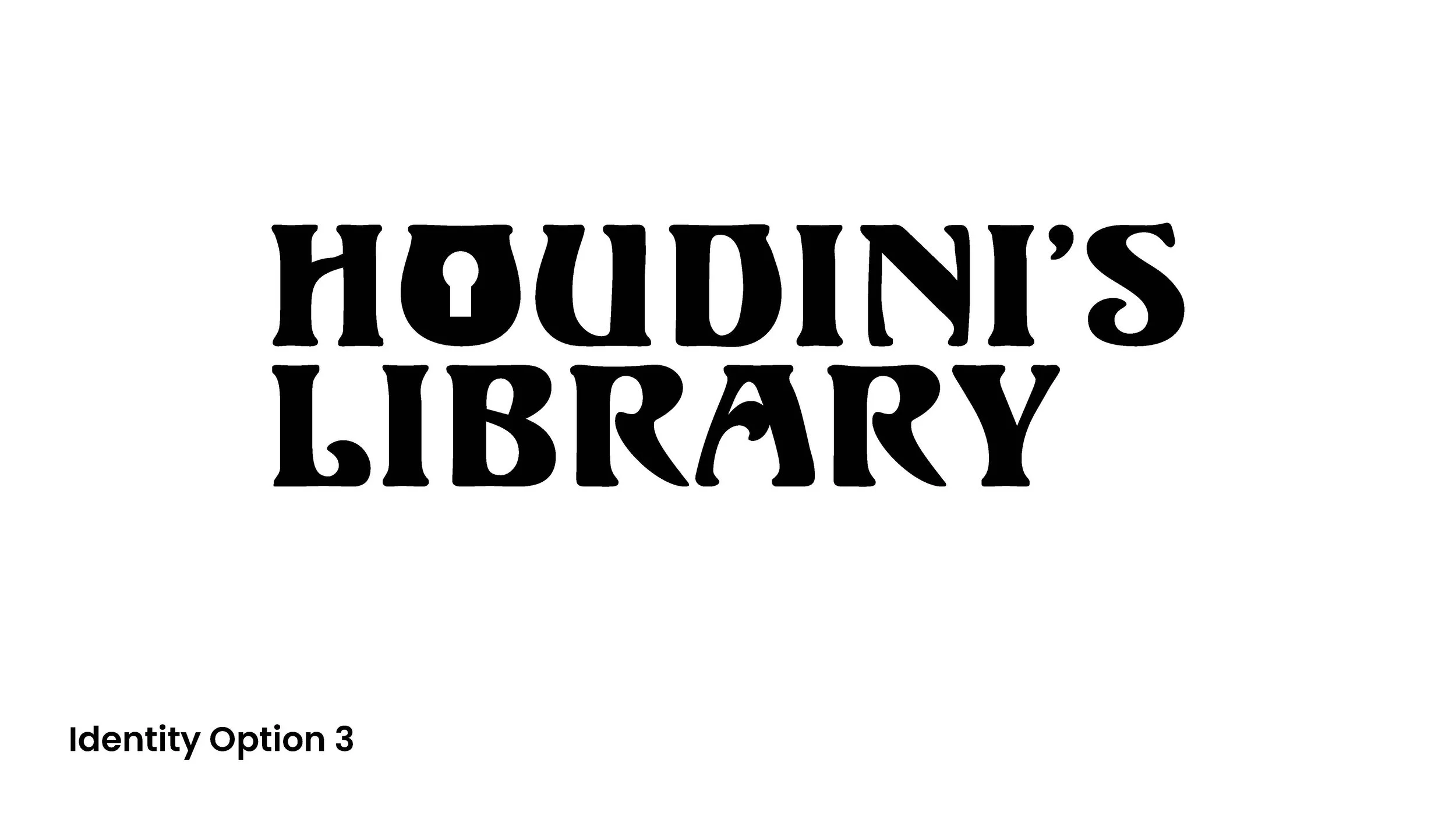
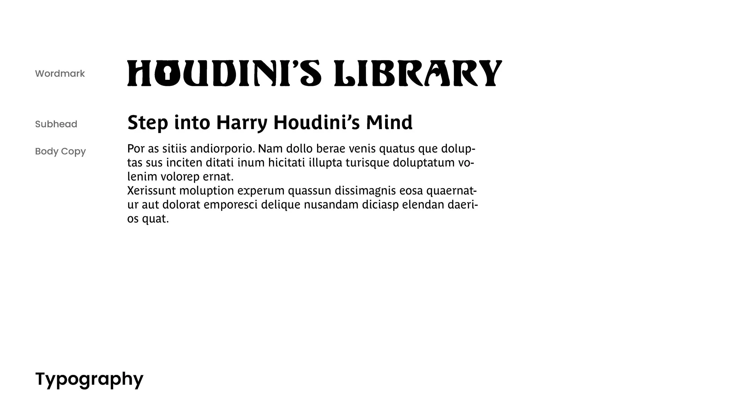
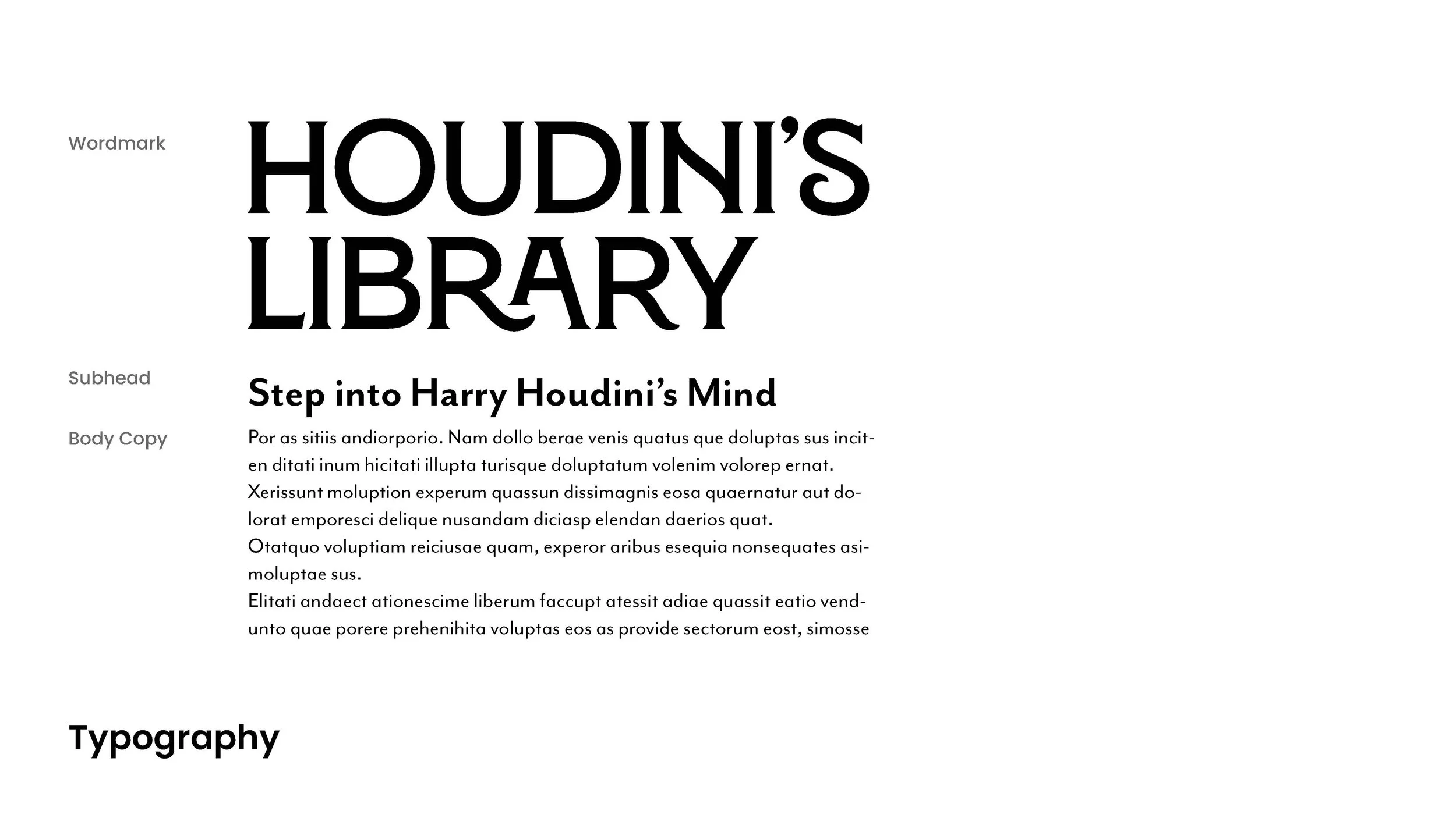
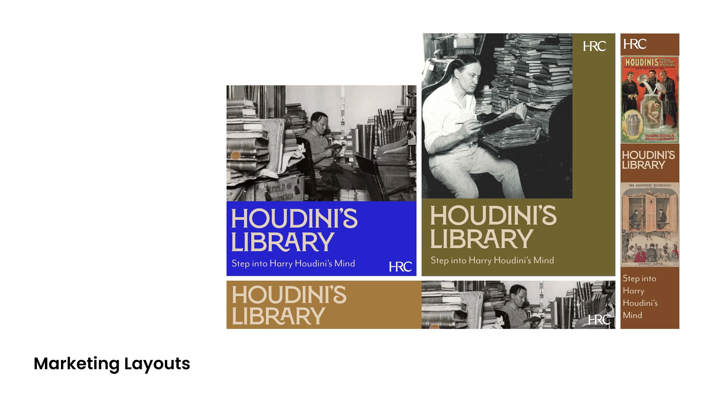
After exploring themes, color combinations, and typefaces, I put together a presentation for the stakeholders to help them understand how the three branding systems would work both in the gallery and outside the gallery, in the form of ads and print materials.
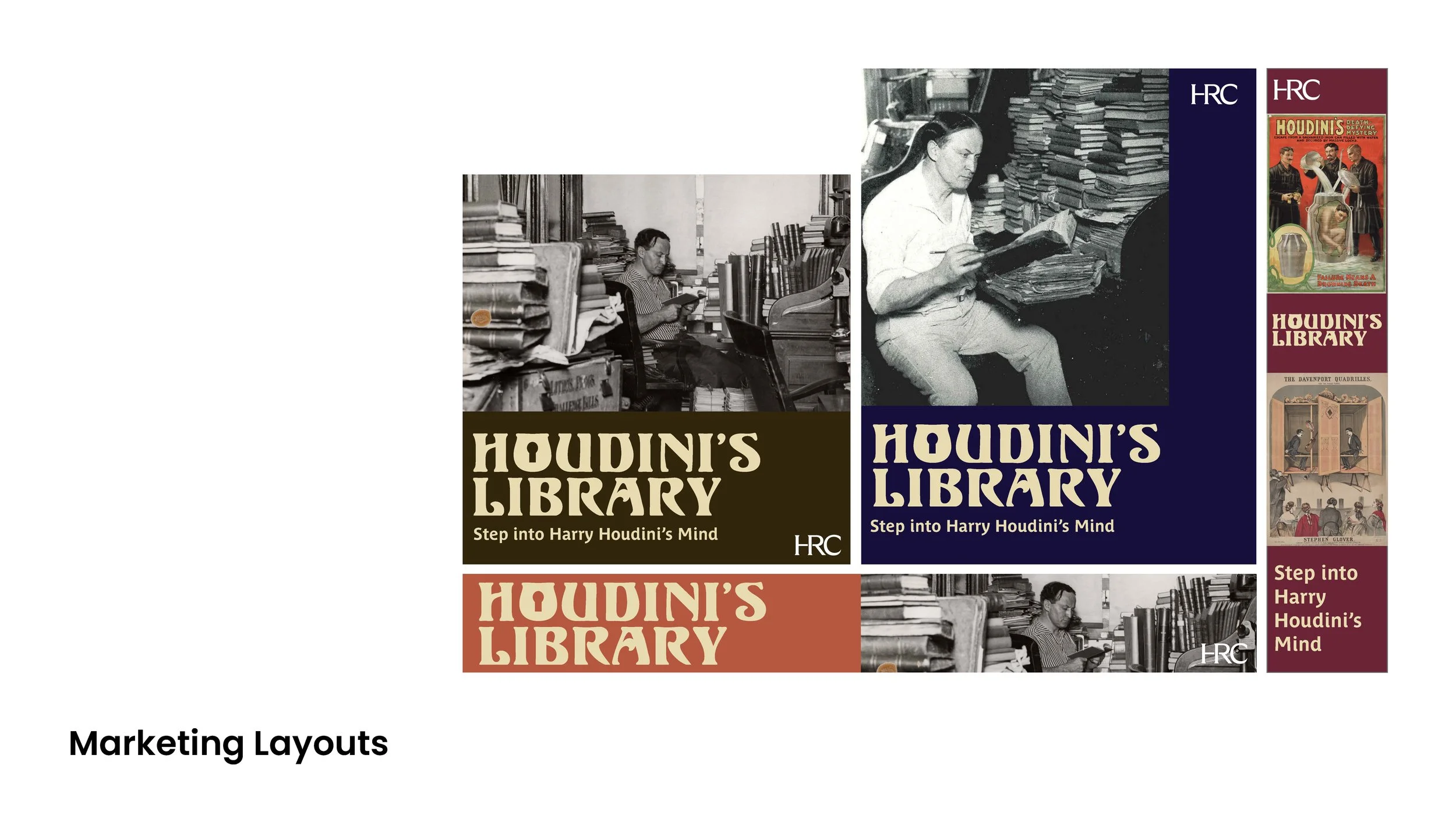
Feedback and Results
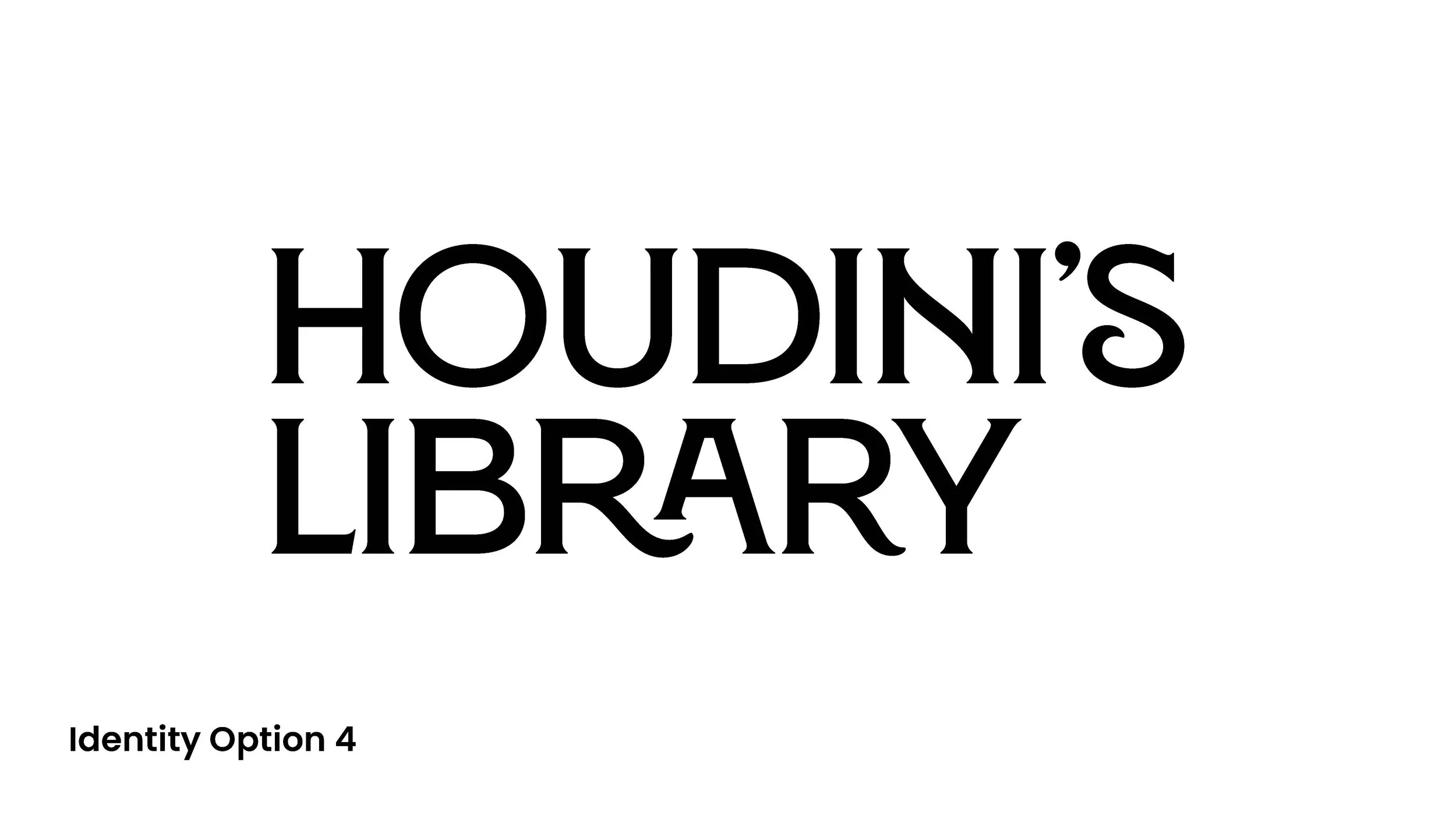
The curator strongly preferred Option 4 for typography and the rich reds and purples used in Option 2.
At the time that we discussed options, I was thinking primarily about print and digital materials and how these colors would translate in those contexts. In hindsight, it would have been helpful to consider how these colors would work in the physical gallery space. It ended up looking fantastic, and I was lucky to have experienced curators and exhibition team members who could help me understand how to select options that would allow for legible gallery text in the low-lighting gallery space.
Final Exhibition Brand Design
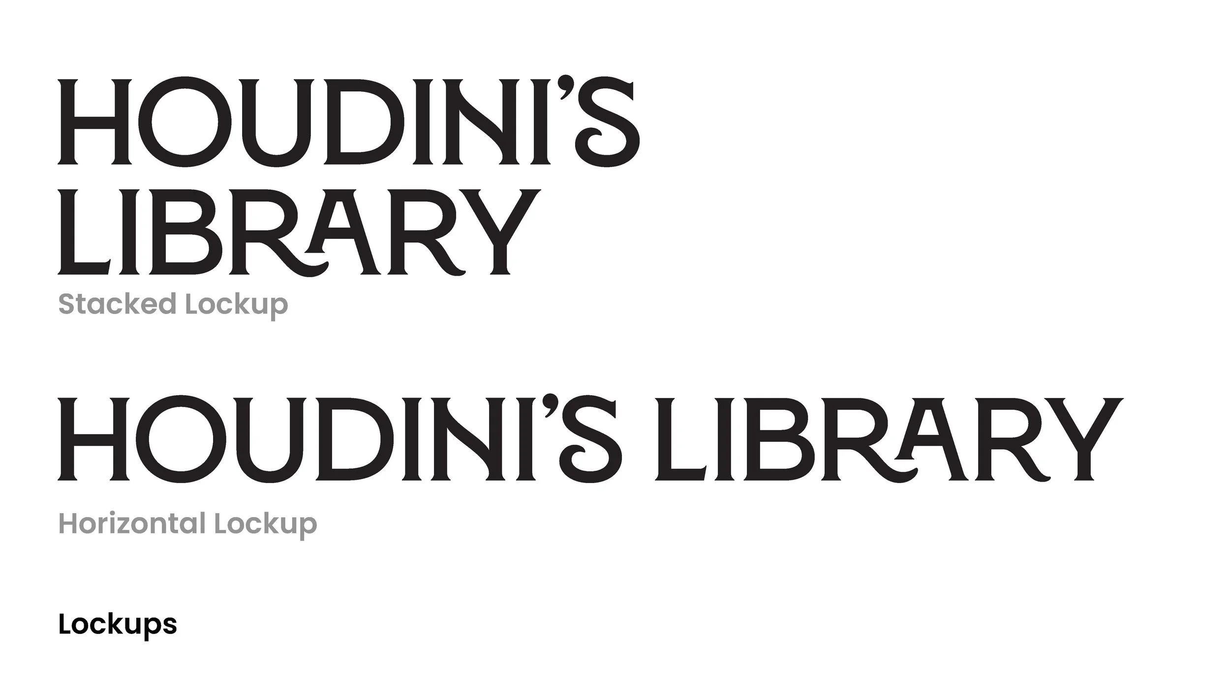
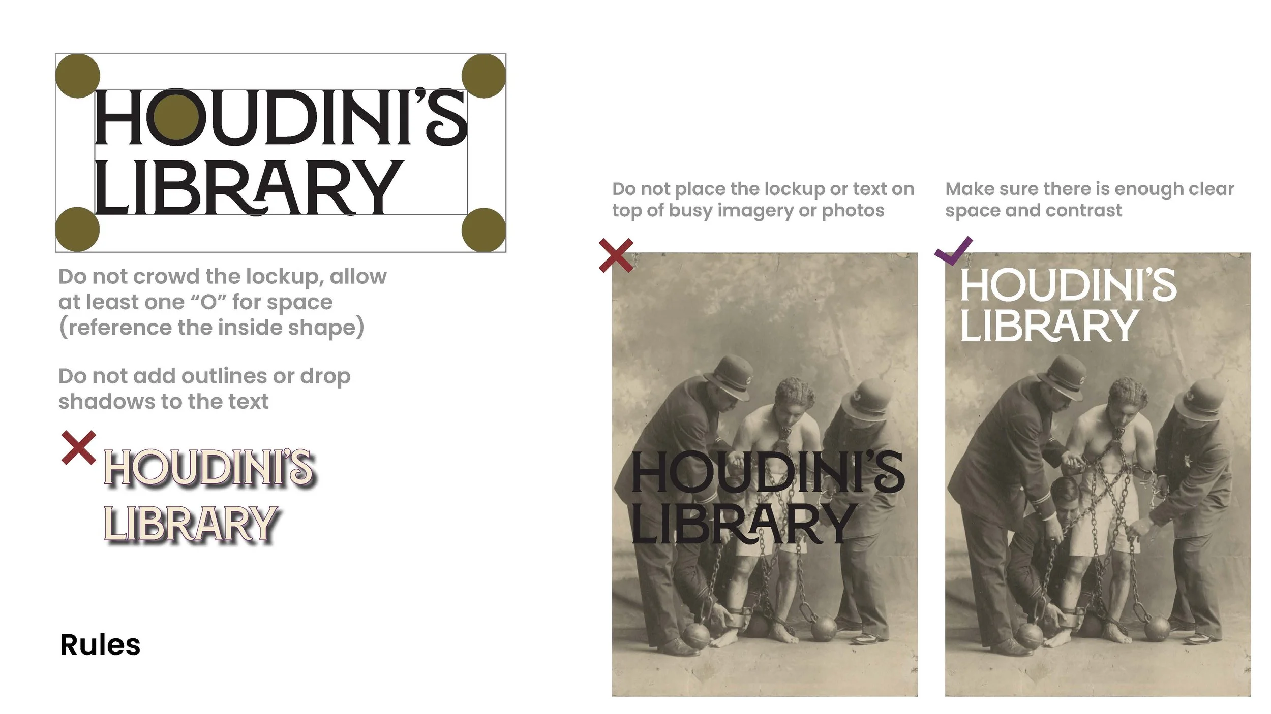
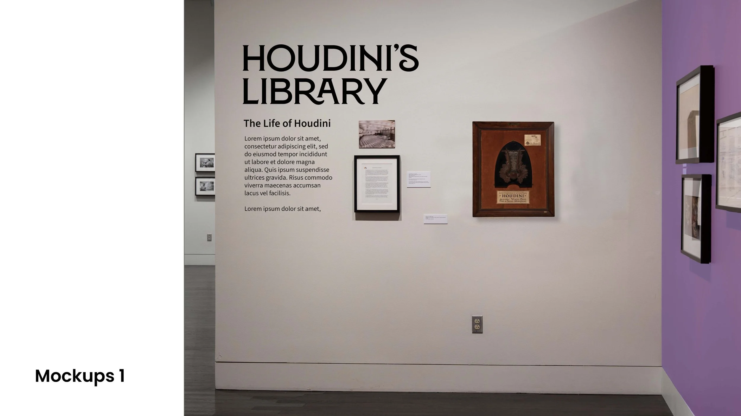
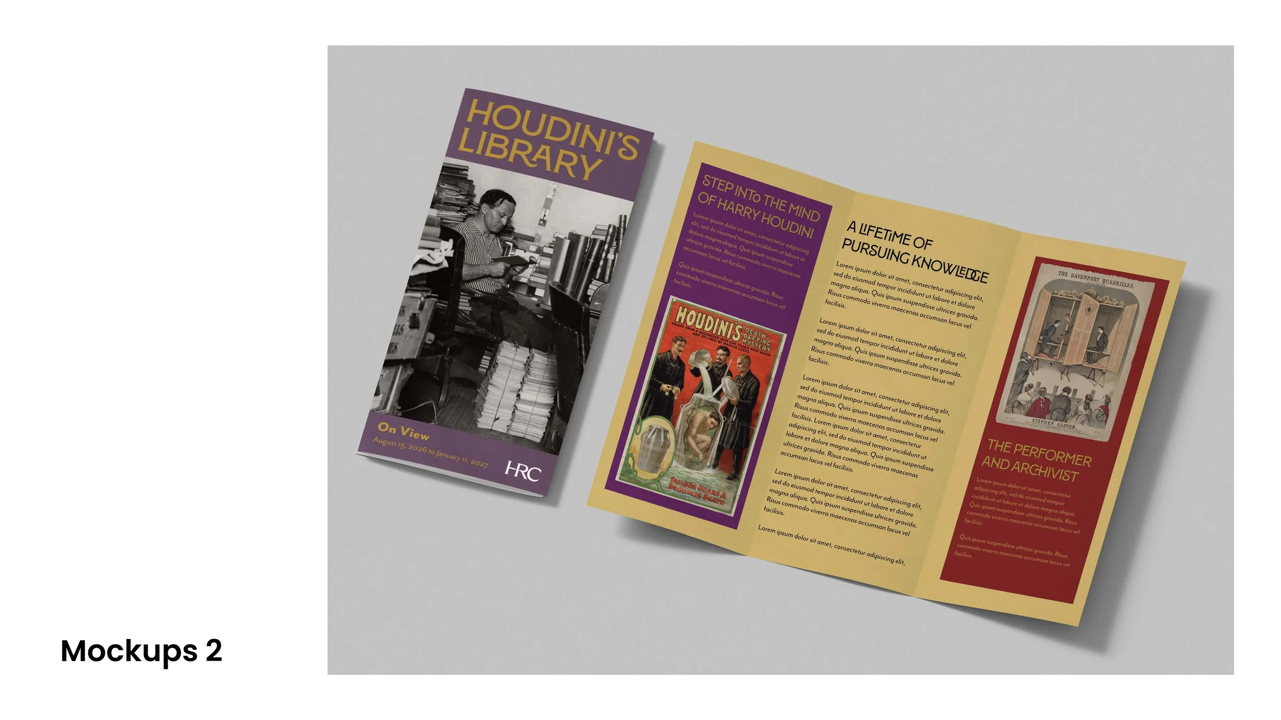
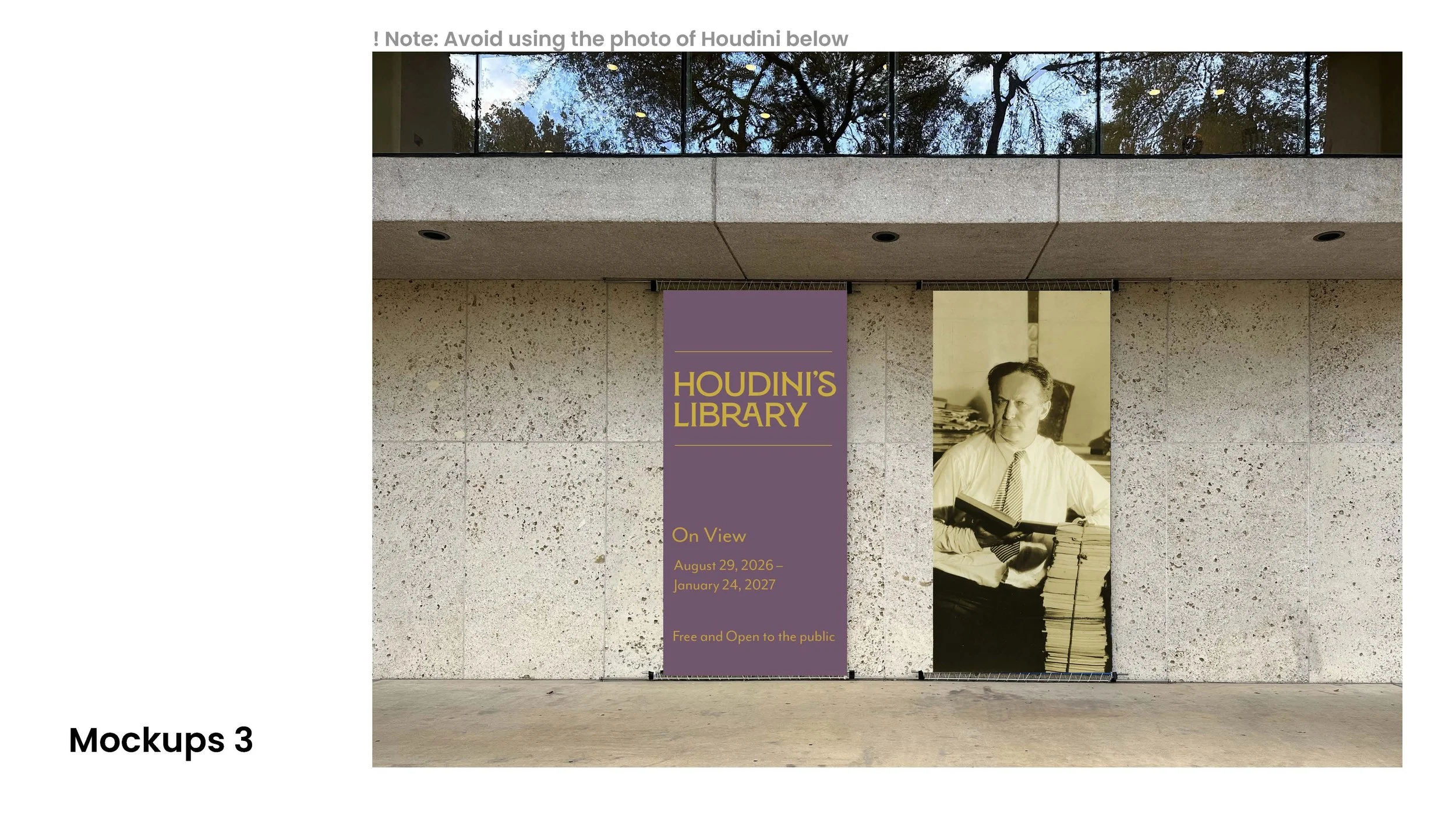
For the final design, I finessed typography choices and debated about the best color options – I again wanted to strike a tone that balanced bright, vivid showmanship with darker tones that would allude to collections, libraries, studies, and books.
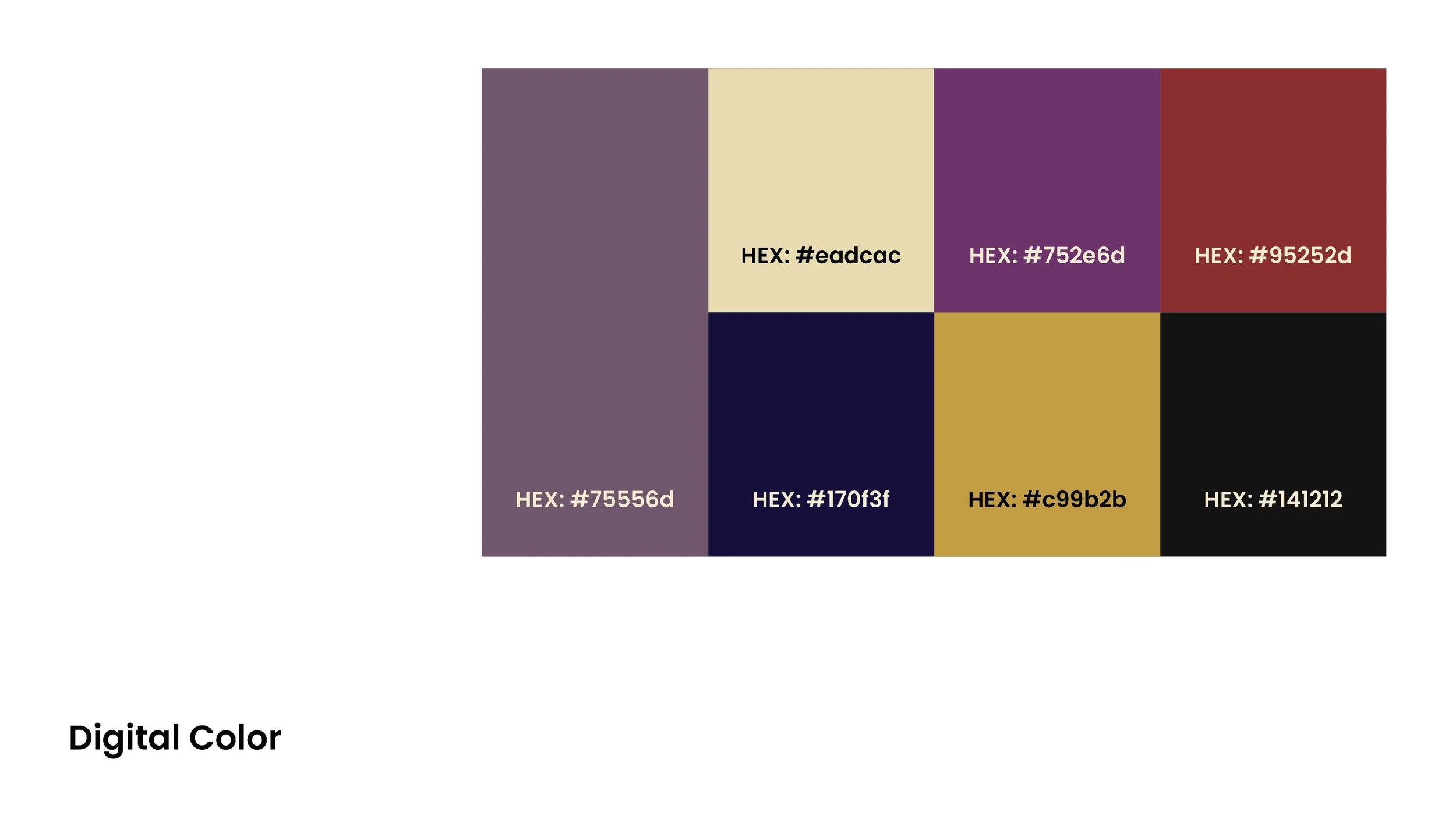
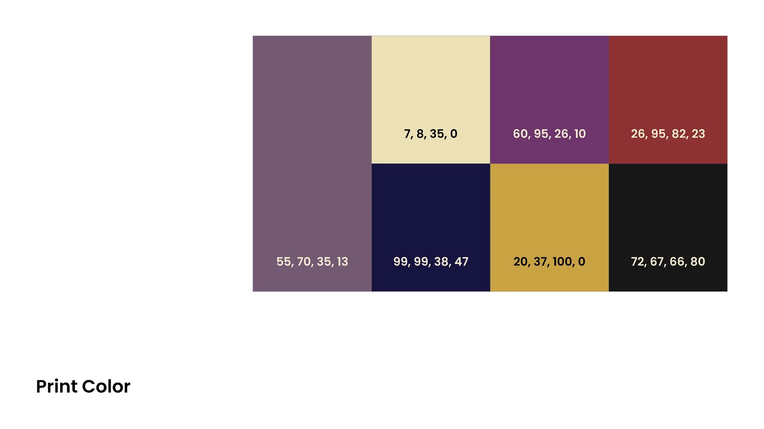
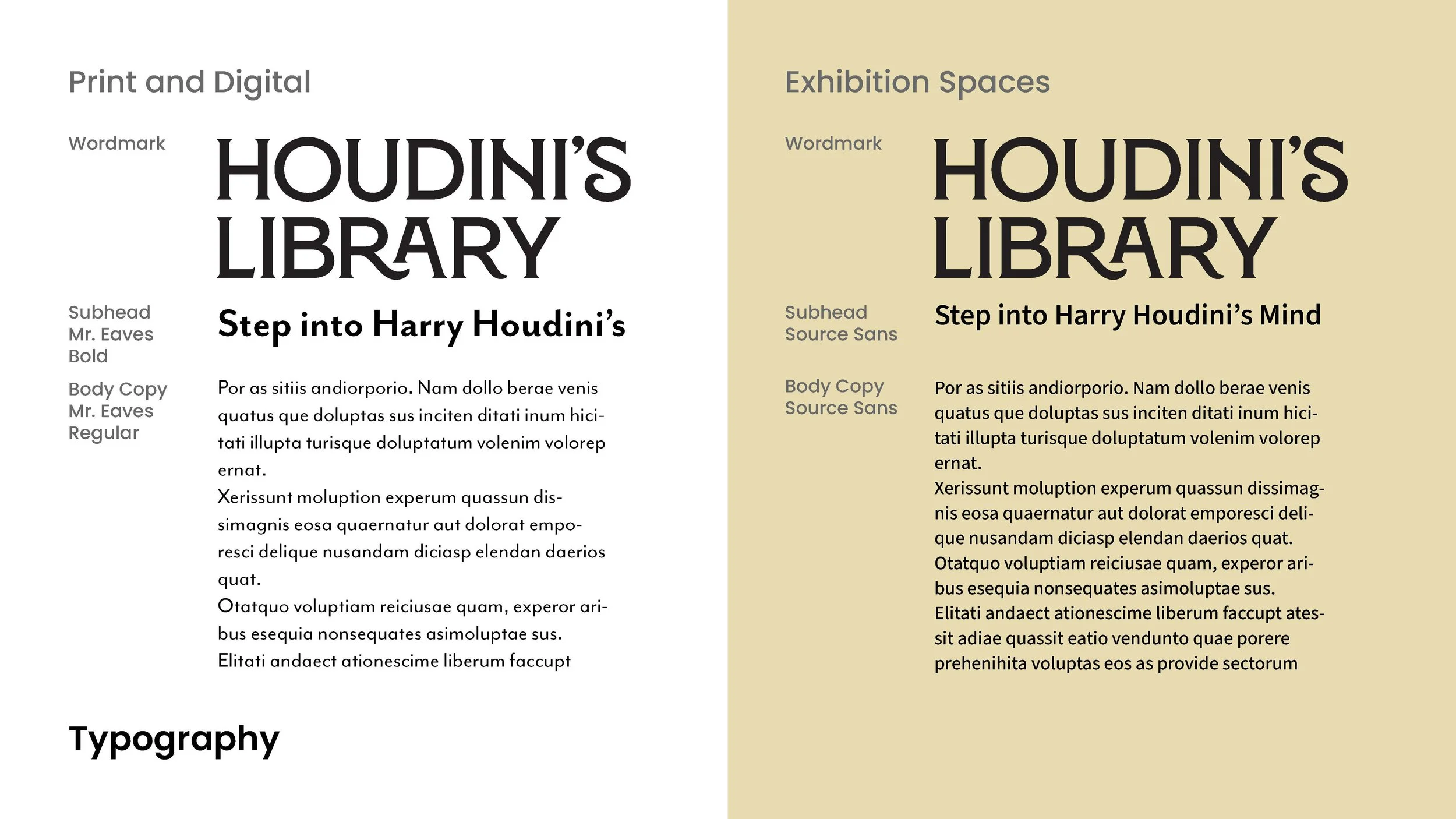
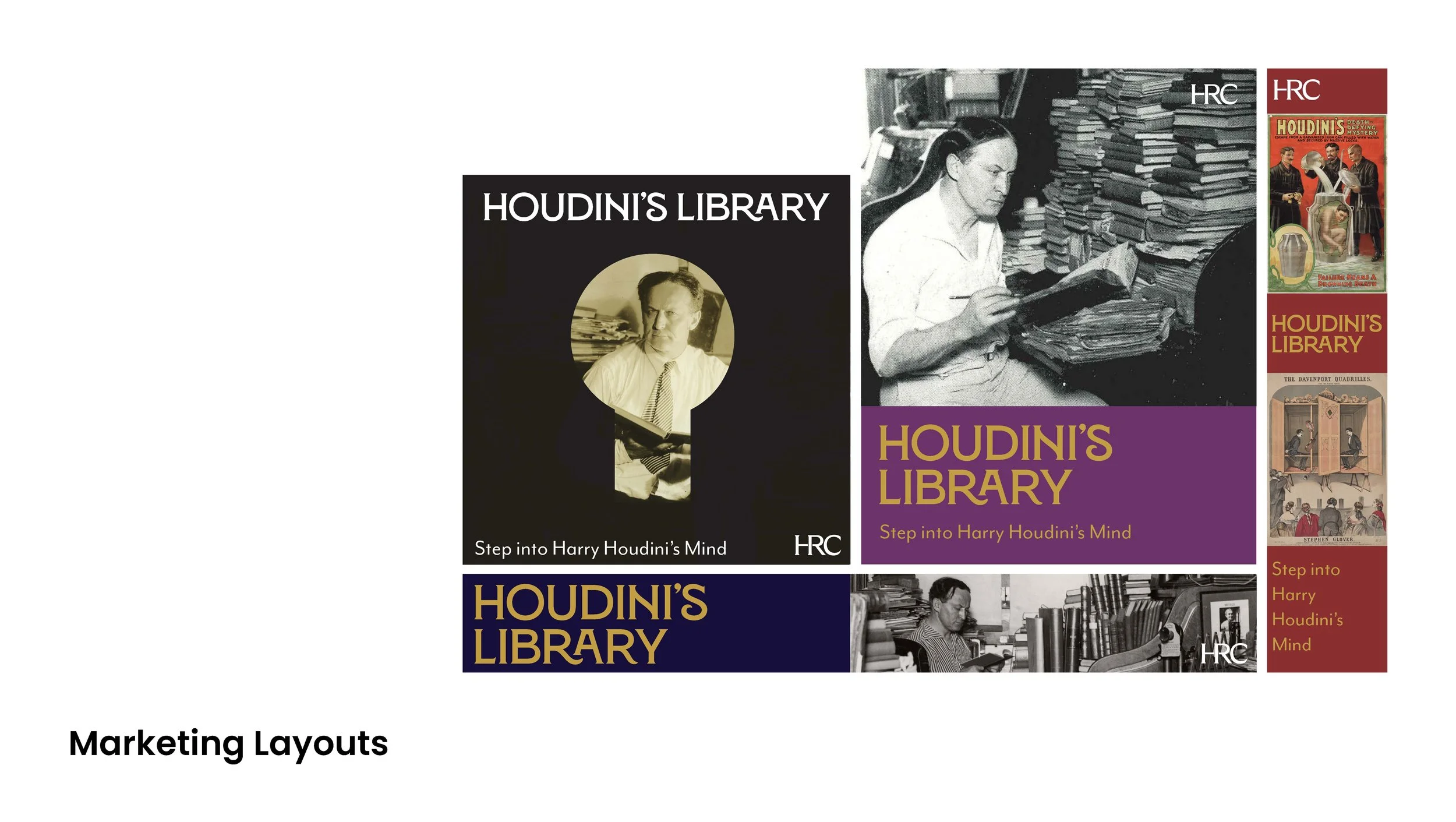
Final Exhibition Results
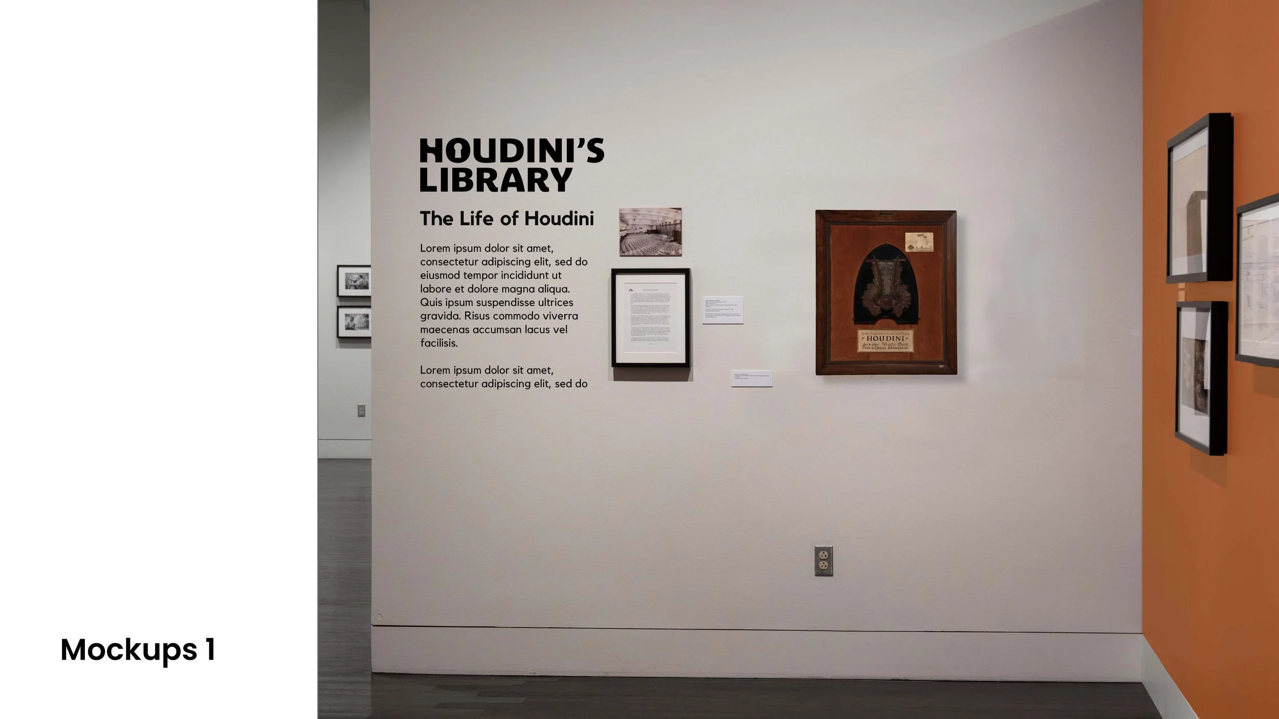
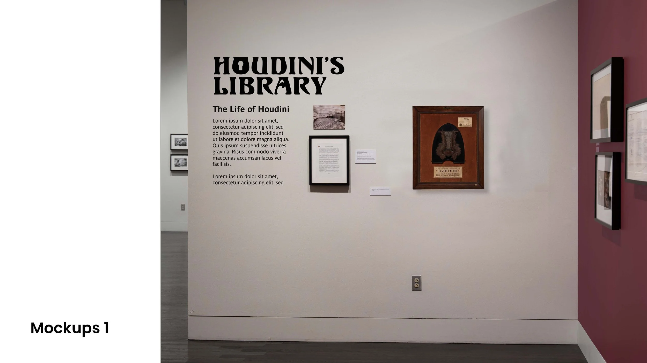
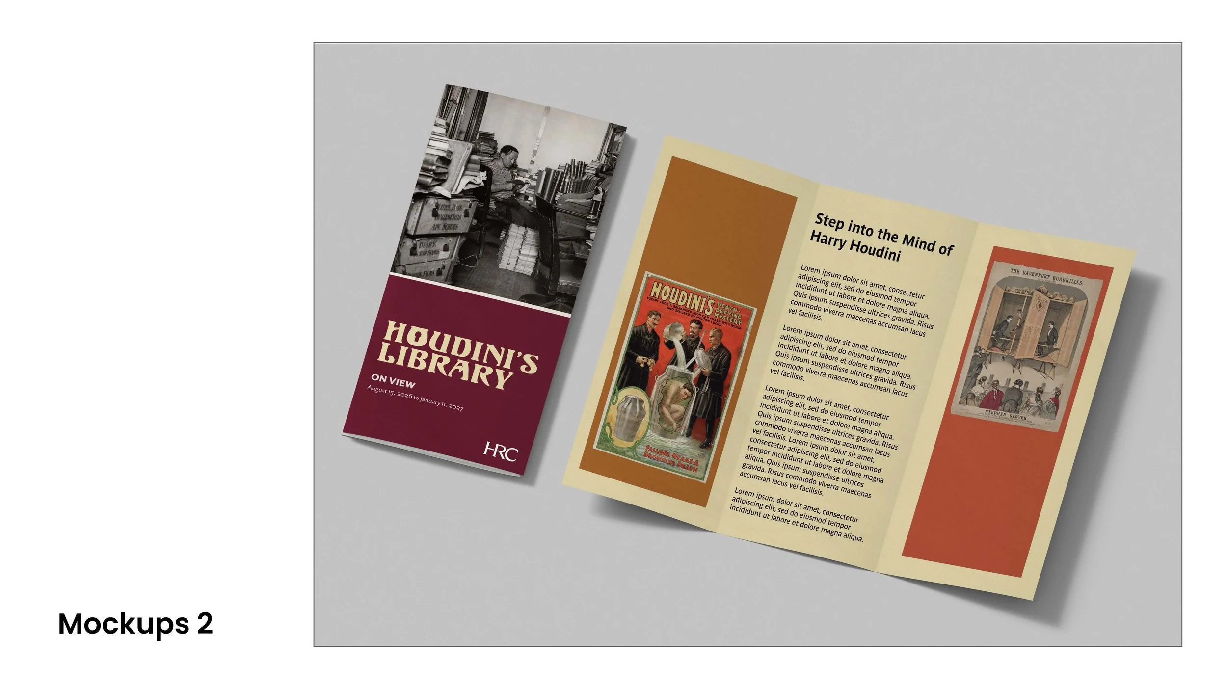
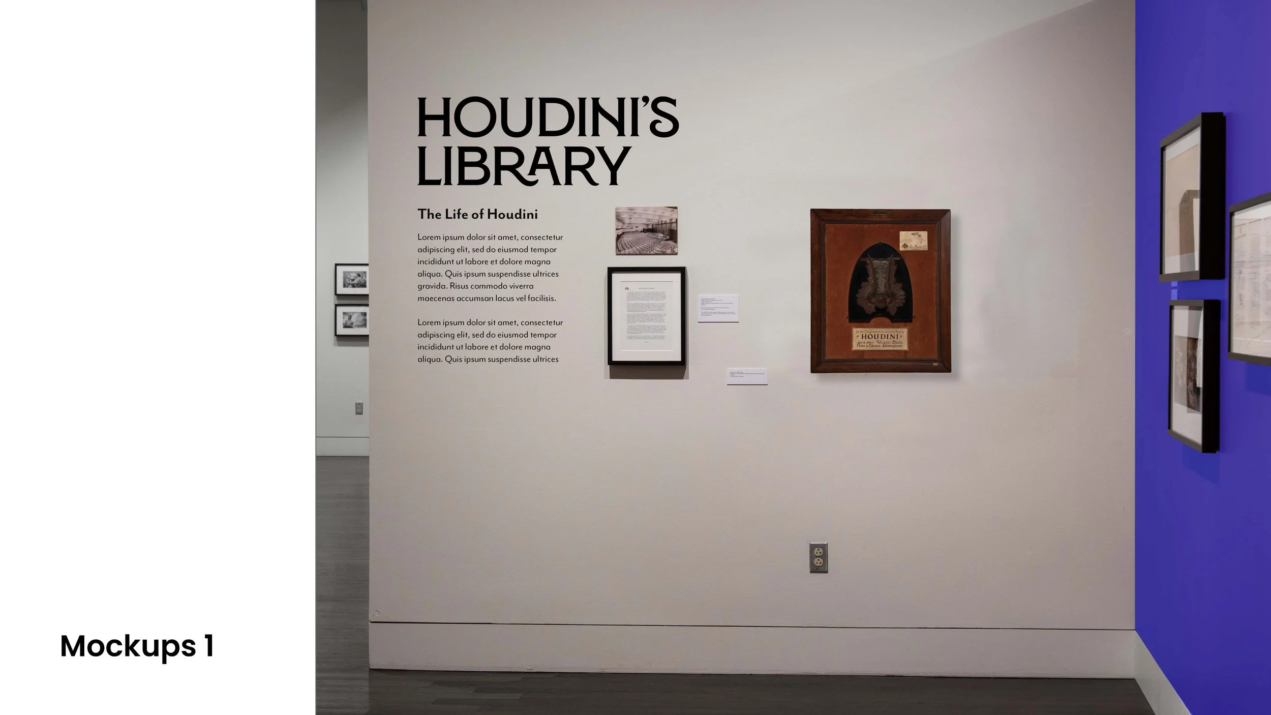
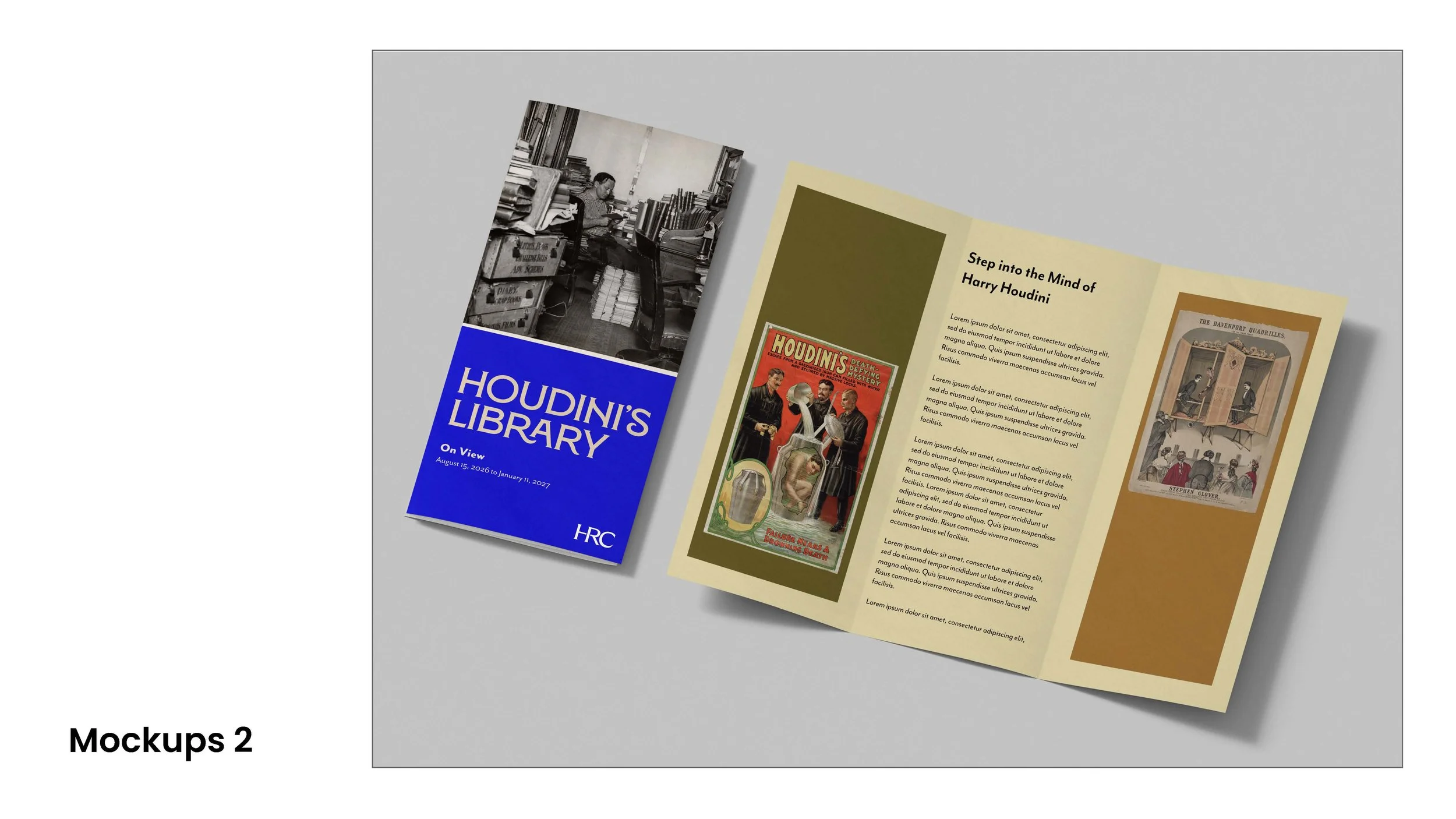
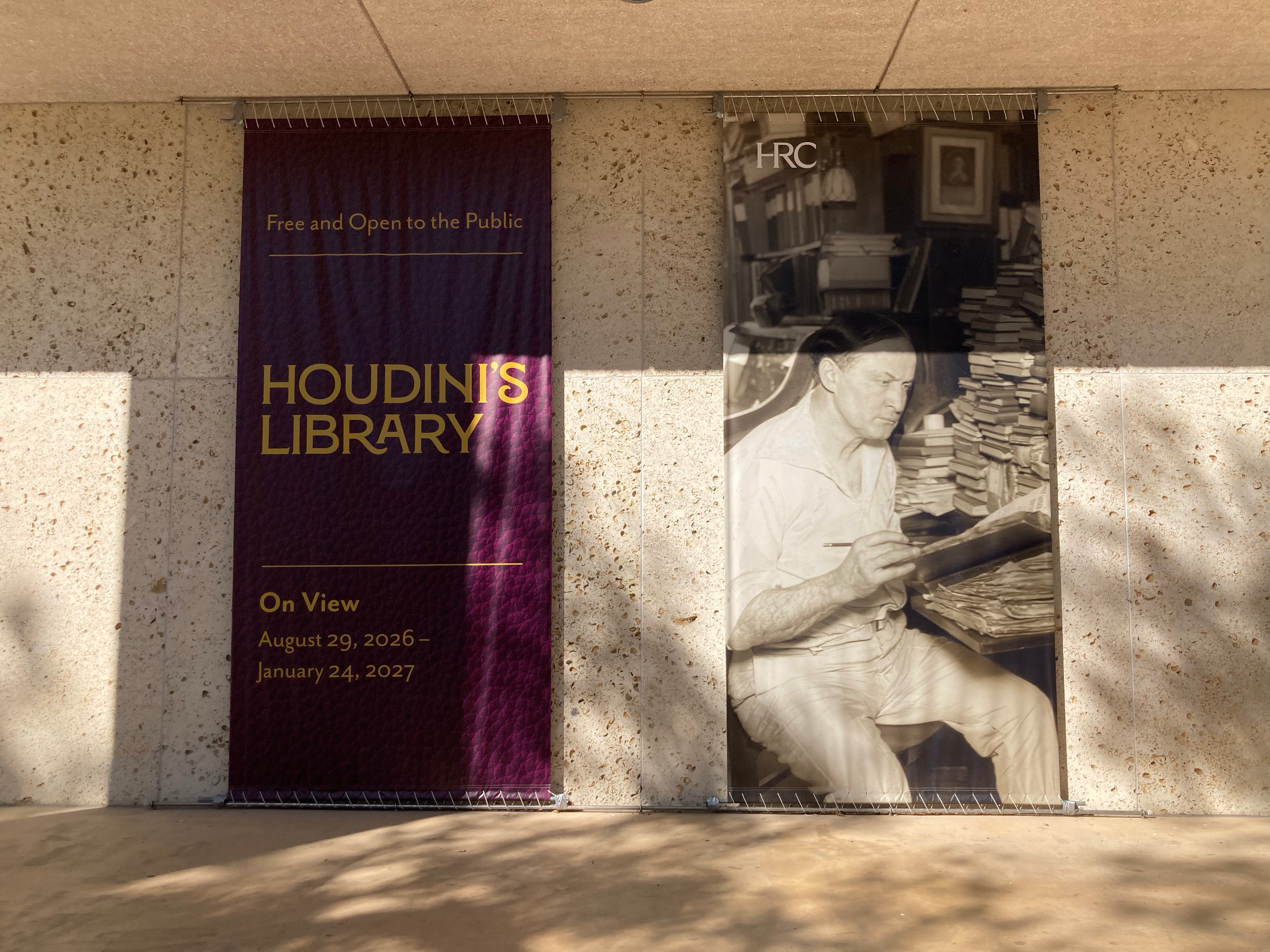
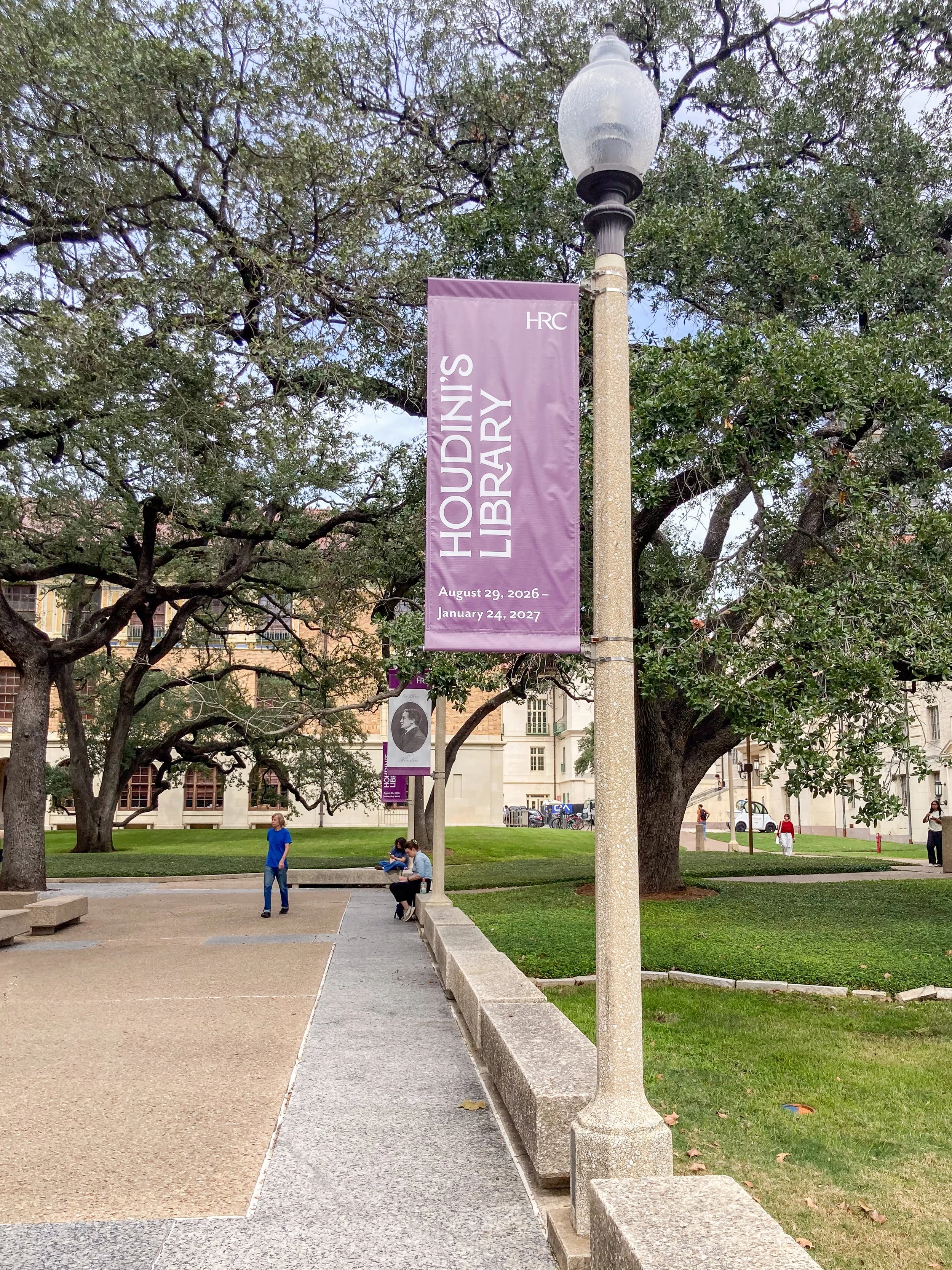
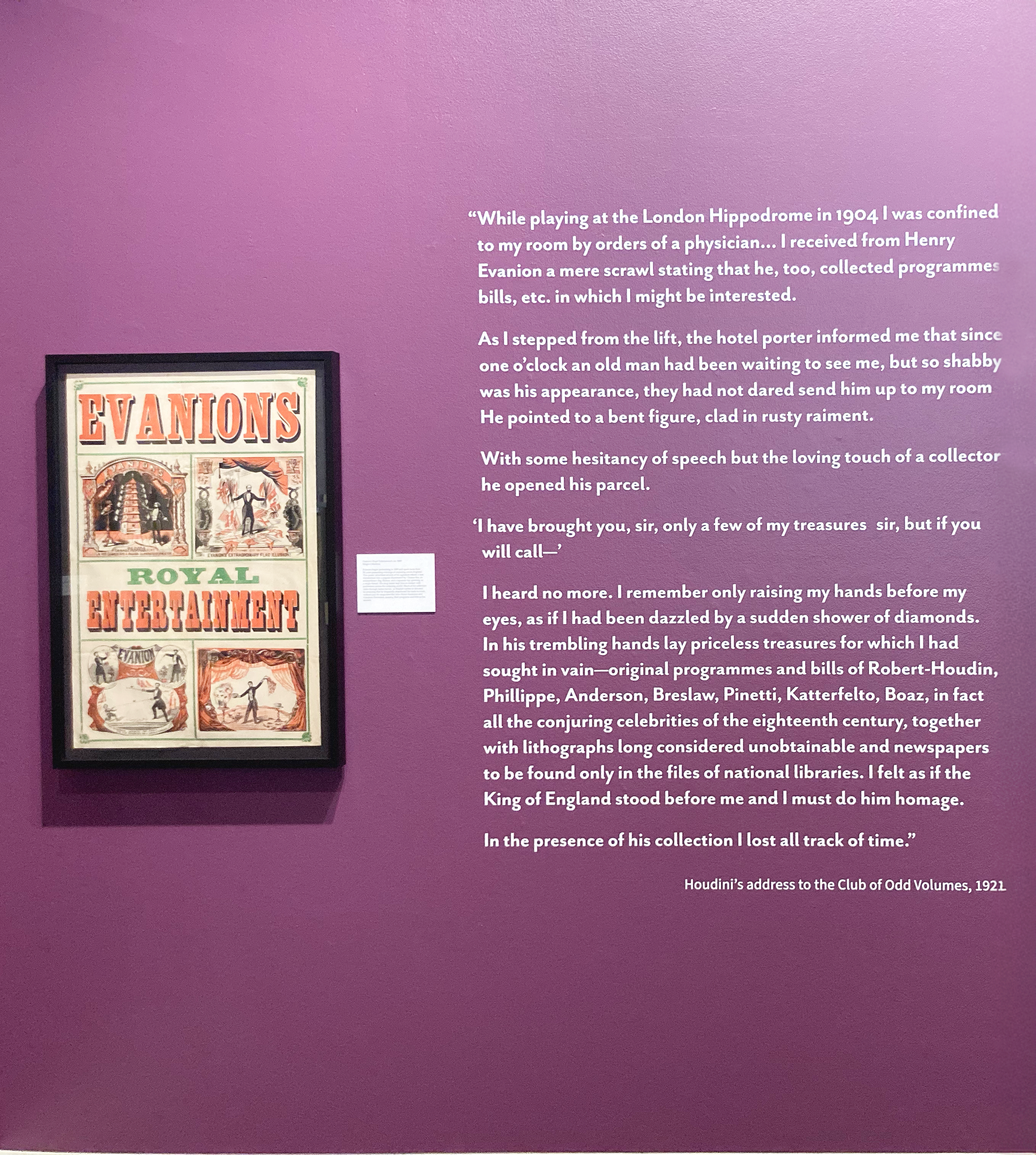
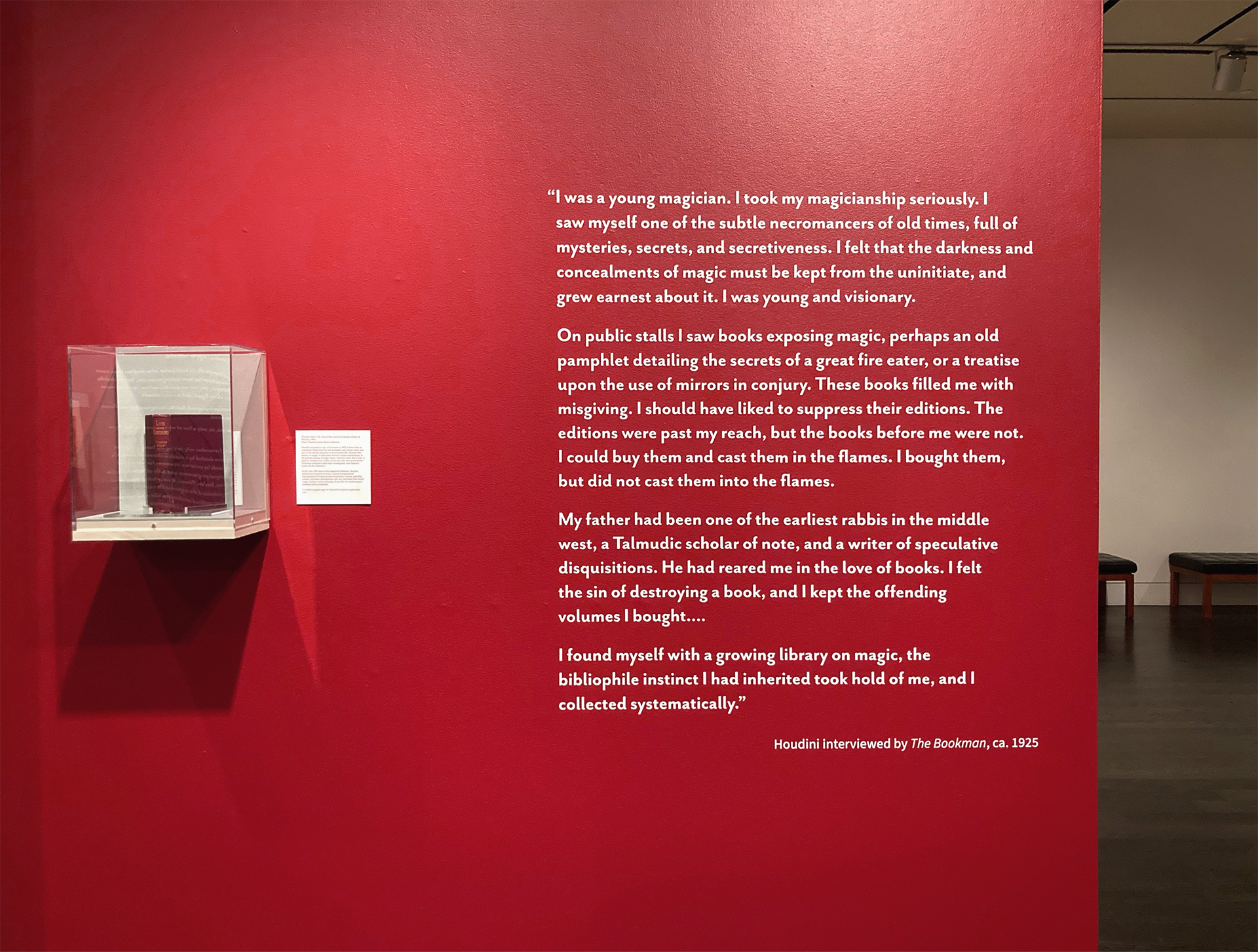
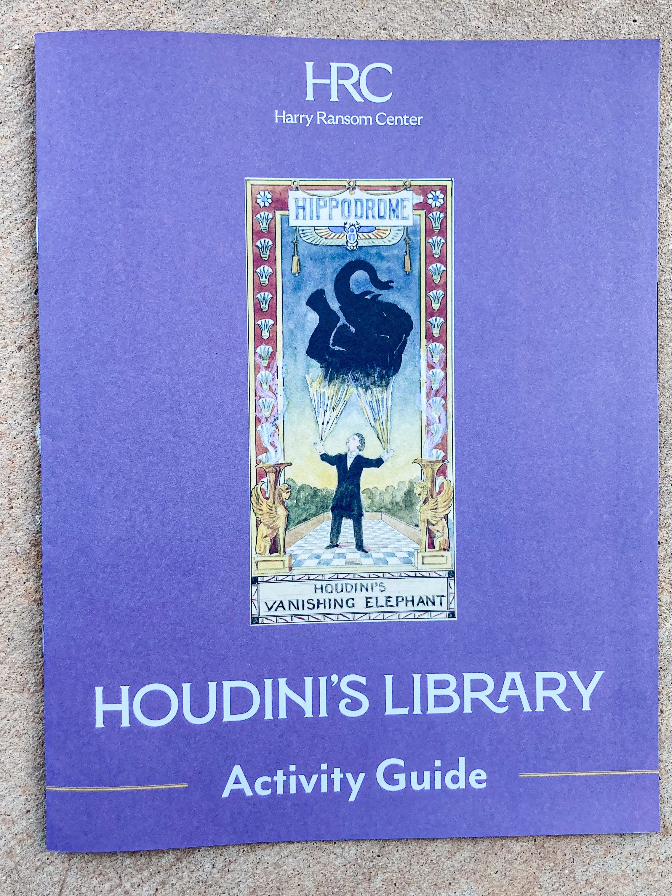
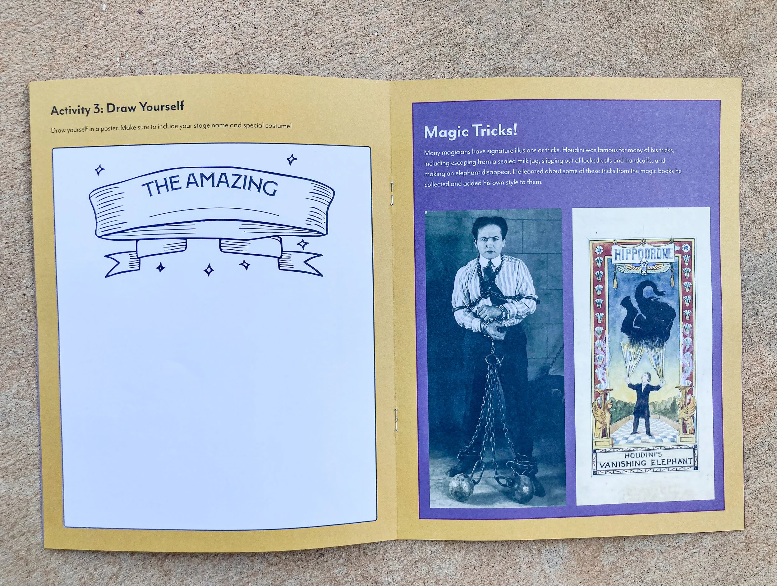
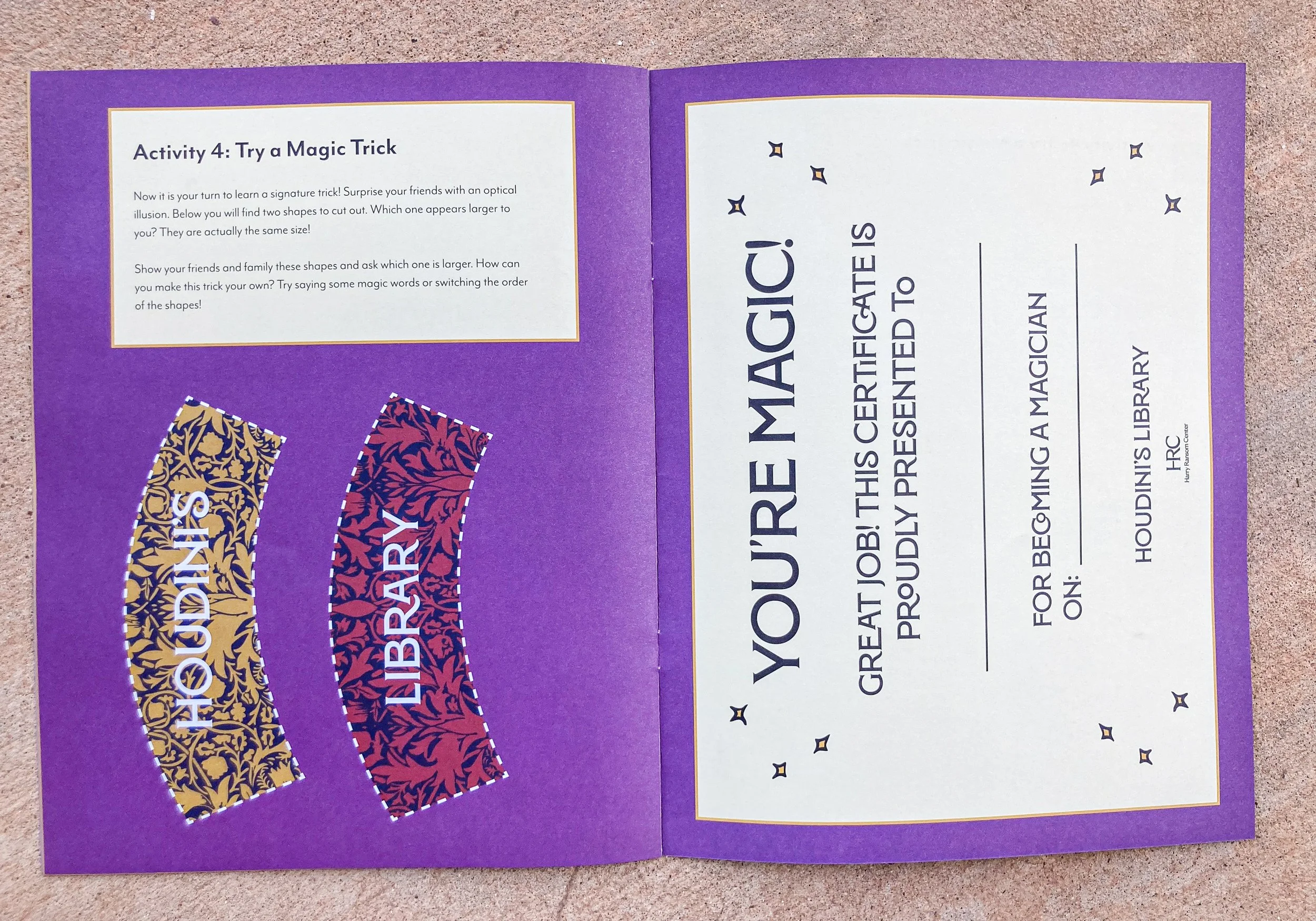
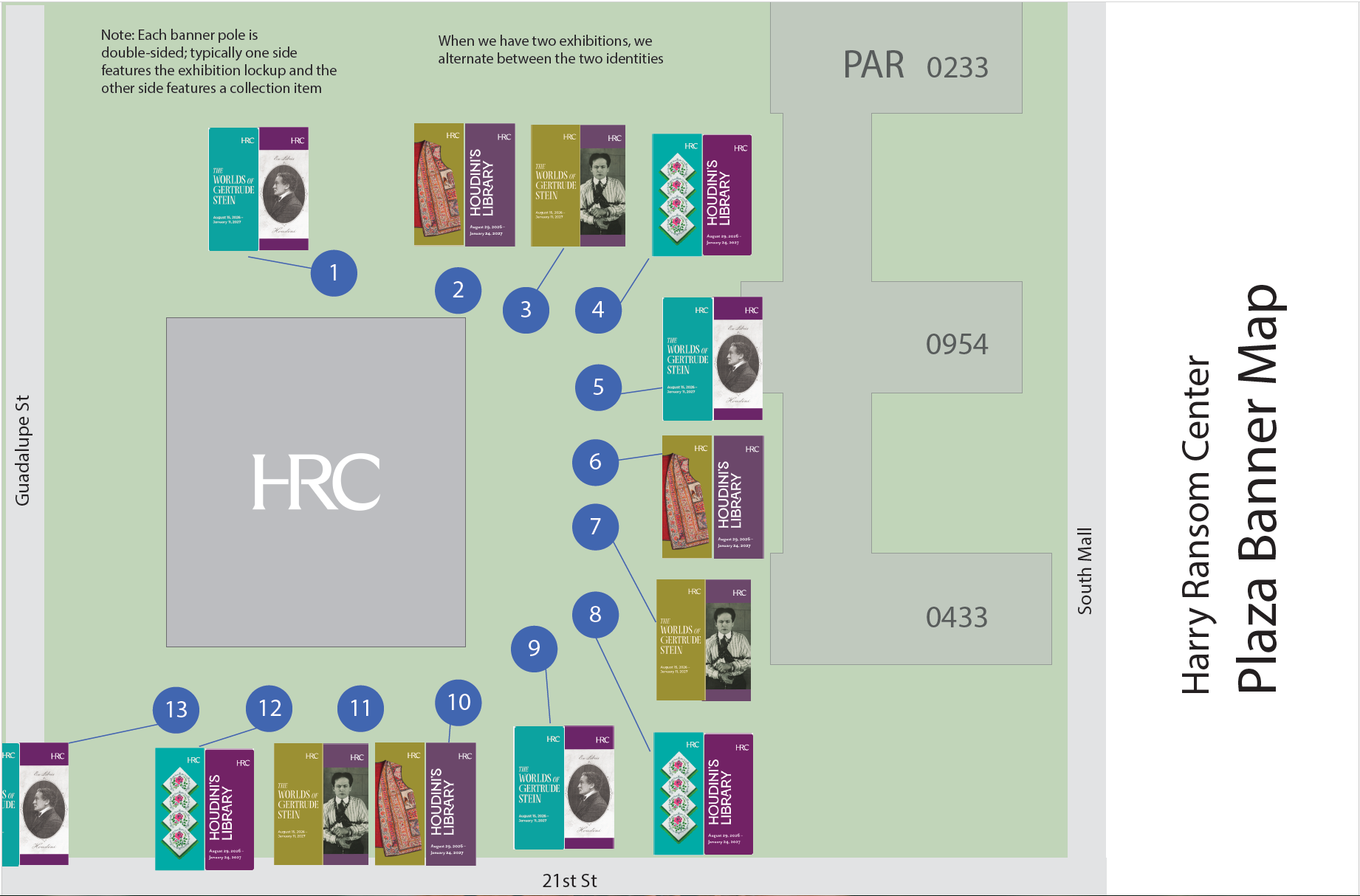
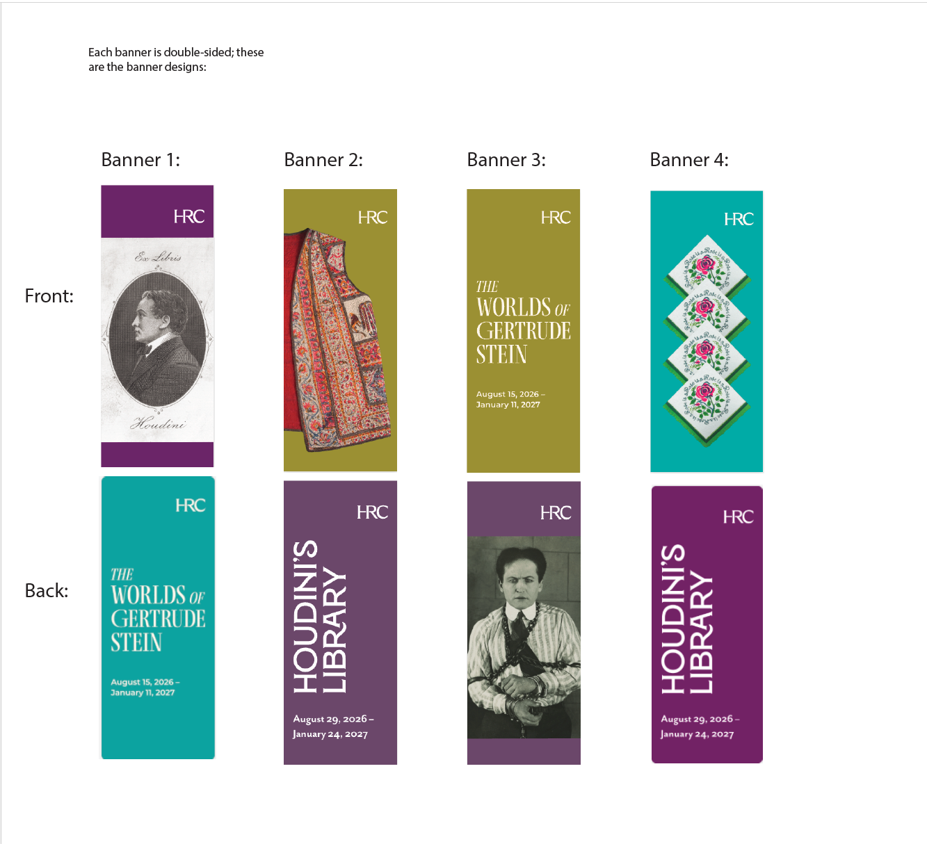
Once the exhibition branding was established, I worked to apply that branding across several areas including entrance banners to the museum, smaller banners around UT’s campus, gallery graphics, and an activity guide for young museum patrons.
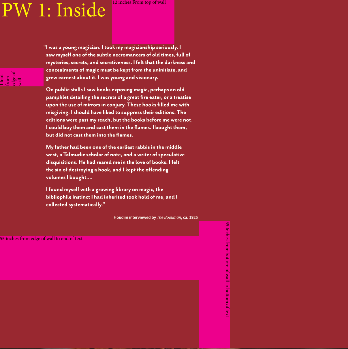
I worked closely with curator Eric Colleary to get estimates for how much space would be taken up by the exhibition items on each wall in the gallery so that I could create estimates for wall text placement and sizing. In the end, I felt that the header text in the gallery space was a little smaller than I wanted, however I knew space would be constrained due to the high volume of items on display and felt it was better to design too small rather than too large.
Reflection
I worked on this exhibition at the same time that I worked on the Gertrude Stein one, so I had a lot to learn in a short amount of time. In some ways Gertrude Stein served as a testing ground, as it was installed a couple of weeks before Houdini, but both installations went remarkably smooth and I learned a lot about how things come together in the gallery space.
In planning, I made mockups of each gallery wall to try to estimate how much space the text would occupy, but since they were only estimates we had to make adjustments for text placement during installation. All in all, installation went smoothly due to my organization (I created diagrams for every gallery wall to help with installation, and spreadsheets with mockups for the vinyl printers.)